Slightly adjust 'MORA' M curve for improved balance
Refining script curve will create a more balanced silhouette.
Enhances overall visual harmony
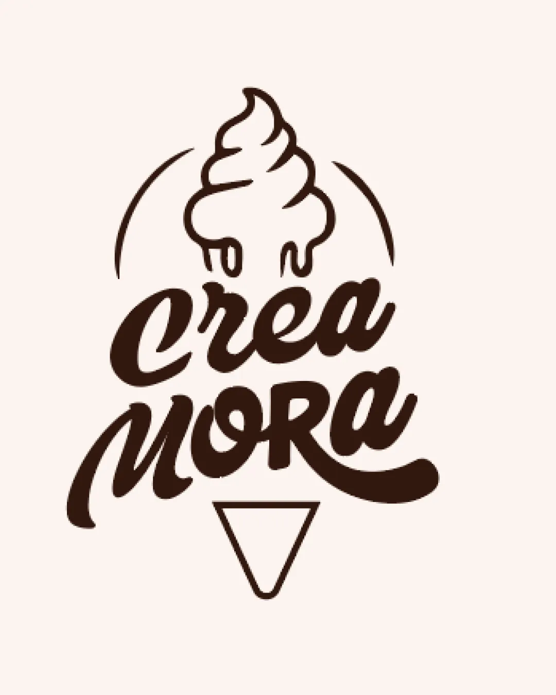
Playful, memorable, and immediately relevant to frozen desserts; a strong logo with only slight polish needed.
Focus on the changes that matter. Keep what makes the logo work.
Refining script curve will create a more balanced silhouette.
Enhances overall visual harmony
Well matched to an ice cream or dessert brand.

Inspect spacing with the guide. Optical balance may differ from geometric centering.
Get a clear logo score, key risks, and priority fix ideas before your client or audience sees it.
More credits needed
Add credits to continue without losing your work.
Then $7/month. Cancel anytime.
Essential logo review with AI
Estimated progress