 View review
Logo score
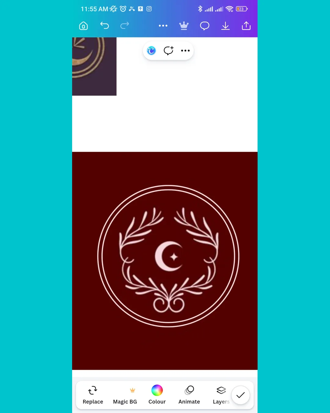
Logo review ofCrescent Moon, Five Pointed Star, Laurel Wreath, D..
Review the detailed scores below to see what is working and what should be refined first.
Originality
Misread
Balance
Scale
Detailed review
Logo performance breakdown
Originality
![]() Classic emblem composition is timeless.
Classic emblem composition is timeless.
![]() The crescent, star, and laurel are commonly used symbols in governmental, religious, cultural, and sporting contexts—overall, the design feels generic.
The crescent, star, and laurel are commonly used symbols in governmental, religious, cultural, and sporting contexts—overall, the design feels generic.![]() No unique or innovative treatment to these well-known elements.
No unique or innovative treatment to these well-known elements.
Color harmony
![]() Only two dominant colors are used, which keeps the logo clean and sophisticated.
Only two dominant colors are used, which keeps the logo clean and sophisticated.![]() High contrast between the logo and background enhances visibility.
High contrast between the logo and background enhances visibility.
Merlot
#750E21
Albescent White
#FFF8E3
Balance alignment
![]() Symmetrical design with well-centered crescent and star.
Symmetrical design with well-centered crescent and star.![]() Circular and laurel border elements provide a sense of cohesion and unity.
Circular and laurel border elements provide a sense of cohesion and unity.

Scalability
![]() Simplified line art style allows for some versatility in scaling.
Simplified line art style allows for some versatility in scaling.![]() Design remains recognizable at medium sizes, such as on official documents or signage.
Design remains recognizable at medium sizes, such as on official documents or signage.
![]() Delicate line details may disappear at small sizes such as business cards, pins, or favicons.
Delicate line details may disappear at small sizes such as business cards, pins, or favicons.![]() Ornamental elements may blur or merge on embroidery or small merchandise.
Ornamental elements may blur or merge on embroidery or small merchandise.
200x250 px
100×125 px
50×62 px
Misinterpretations
![]() No inappropriate dual meanings or unintended imagery detected.
No inappropriate dual meanings or unintended imagery detected.
Try your own review
Review my logo
Wondering how your logo performs?
Get a clear logo score, key risks, and priority fix ideas before your client or audience sees it.
Keep exploring


