 View review
Logo score
Logo review of
Cuebud, The Presentation Companion
Review the detailed scores below to see what is working and what should be refined first.
Objective AI feedback. Your creative decision.
Legibility
Originality
Misread
Balance
Scale
Detailed review
Logo performance breakdown
Legibility
 Text is highly readable with clear sans-serif fonts. Good contrast between 'Cue' (blue) and 'Bud' (black). Tagline is legible and well sized beneath the main wordmark.
Originality
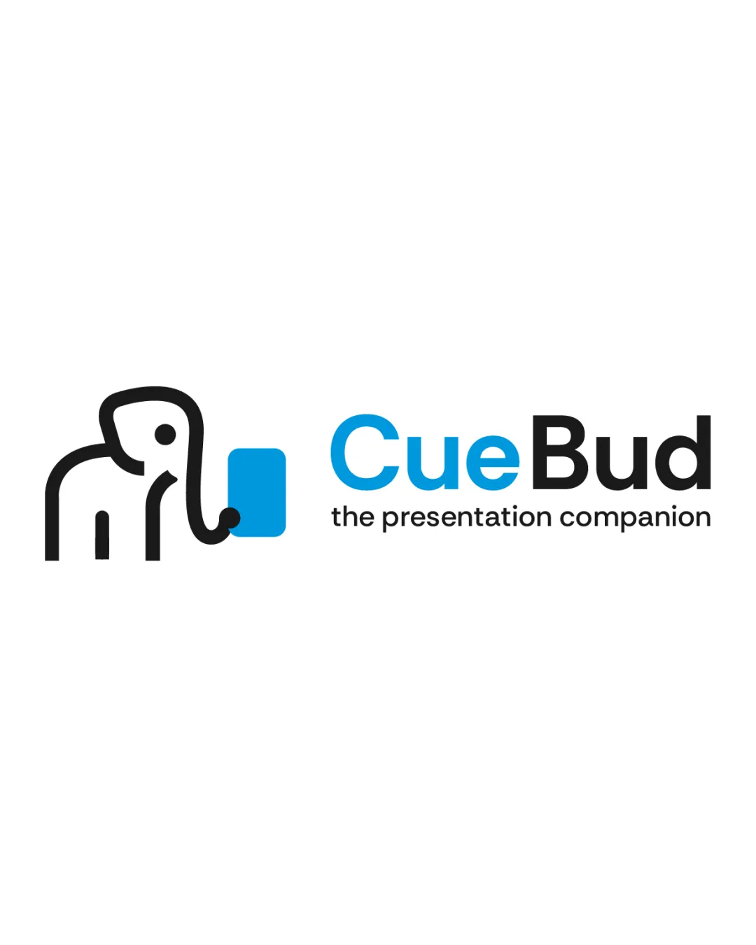
Elephant as a presentation companion feels unique and friendly. Integration of the blue square with the trunk provides a fresh twist and slight double-meaning referencing a presentation 'cue' or slide.
 Elephants as symbols are not the most common, but animal-based mascots are a familiar trope. Creative execution saves it from feeling generic, but some originality could be further enhanced by more unexpected detailing.
Color harmony
Limited, consistent color palette; colors are well balanced. Strong contrast between blue, black and white for maximum clarity.
Black
#000000
Blue
#009FE3
White
#FFFFFF
Balance alignment
Symbol and wordmark are well aligned horizontally, giving the logo a cohesive appearance. Weight of the elephant matches the boldness of the main text.
The symbol and wordmark could be slightly better balanced vertically to ensure maximum harmony, as the symbol sits slightly lower due to the trunk's curve.

Scalability
Bold lines and minimal details make the logo scalable for small sizes such as app icons or favicons. Simple symbol works well in digital and print contexts.
Tagline may become illegible at very small sizes such as business cards or small product labels.
200x250 px
100×125 px
50×62 px
Misinterpretations
No inappropriate or confusing hidden shapes detected. Positive associations due to elephant representing memory and reliability.
Symbol & text fit
Both logomark and wordmark exhibit a cohesive, modern style.
Color linking (blue square, blue text) unifies the visual identity.
Try your own review
Review my logo
Wondering how your logo performs?
Get a clear logo score, key risks, and priority fix ideas before your client or audience sees it.
Keep exploring