View review
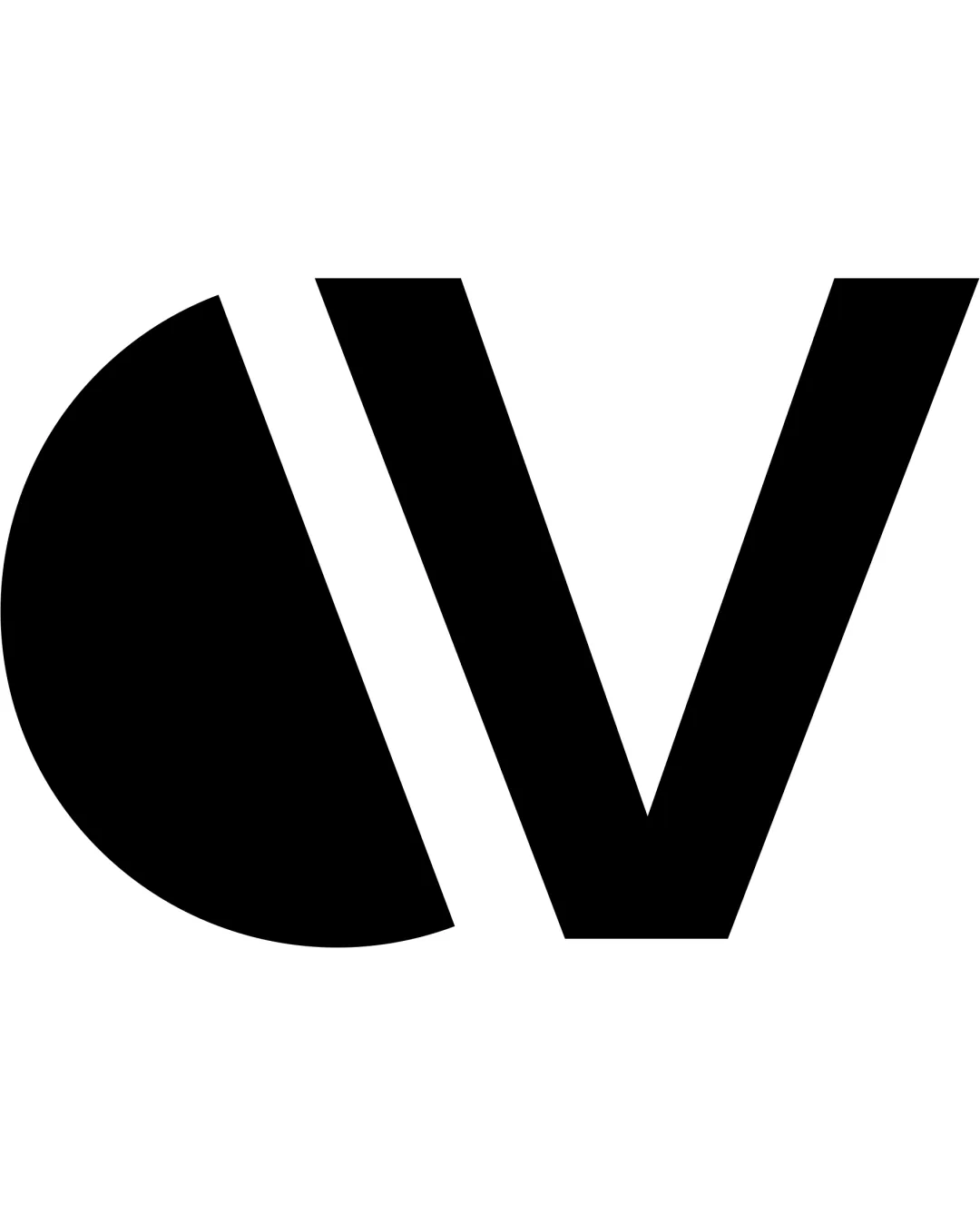
Logo review ofCv
Polished, versatile, and client-ready for a graphic design studio, with only minor improvements needed for maximum impact.
What to fix first
The most important fixes to handle before polishing the full presentation.
Refine the geometric relationship between the 'C' and 'V' to reduce tension and improve visual flow/alignment.
Medium priorityThe current white gap and stark geometric transition could be softened for a more harmonious feel without losing strength.
Impact: Moderate: Will Make The Logo Look More Polished And Intentional For Discerning Clients. · Effort: Medium
Logo performance breakdown
Legibility
Letterforms are bold and clear.
Slight abstraction may slow initial recognition for unfamiliar viewers.
Originality
Clean geometric monogram.
Styling is familiar and geometric monograms are common in creative fields.
Color harmony
Monochrome palette is classic and versatile.
Black
#000000
White
#FFFFFF
Balance alignment
Good overall optical weight and spacing.
Semi-circle and straight lines create tension; vertical alignment could be improved.
Scalability
Bold, high-contrast shapes work in all sizes and in one color.
200x250 px
100×125 px
50×62 px
Misinterpretations
No inappropriate or confusing visual resemblance detected.
Brief match
Targeting Small/medium Business And Rebranding: The bold, modern look signals confidence and professionalism, fitting for a studio focused on visual impact and contemporary branding.
Wondering how your logo performs?
Get a clear logo score, key risks, and priority fix ideas before your client or audience sees it.