 View review
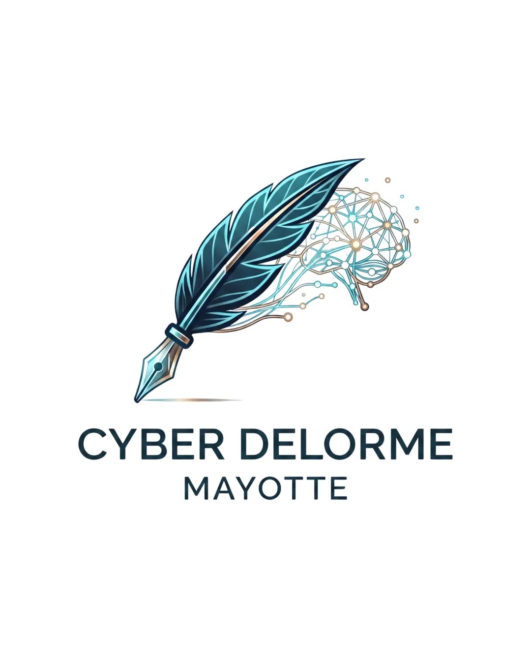
Logo score
Logo review of
Cyber Delorme Mayotte
Distinctive, relevant, and professionally executed blend of tradition and technology; well-suited for a knowledgeable, modern brand.
Objective AI feedback. Your creative decision.
Legibility
Originality
Misread
Balance
Scale
Action plan
What to fix first
The most important fixes to handle before polishing the full presentation.
1
Simplify neural network details in the mark for better visibility at small sizes
High priorityThe intricate network lines risk disappearing or blurring in smaller applications.
Impact: Improves Scalability And Logo Versatility · Effort: Medium
2
Harmonize illustration and font style further if needed
Medium priorityA slight disconnect remains between the illustrative flourish and the flat, bold font style.
Impact: Unifies Professional Impression · Effort: Low
Detailed review
Logo performance breakdown
Legibility
 Wordmark is clear and easy to read Font is bold with excellent spacing
Originality
Creative blend of traditional and tech imagery Uncommon illustrative style for the sector
Color harmony
Modern teal and tan palette feels fresh and professional
Teal
#185A6C
Tan
#E6CBA8
Dark Gray
#2B3440
Your palette is close. Refine the color roles and combinations before updating the logo.
Build brand colorsBalance alignment
Strong central alignment between mark and text Mark does not overpower wordmark
 Slight complexity in the mark can feel visually heavier on the right

Scalability
Central mark remains recognizable at medium size
Fine lines in the neural network detail may be lost at small sizes
200x250 px
100×125 px
50×62 px
Misinterpretations
No negative or confusing alternate readings
Logo structure & brief match
Mark and wordmark both convey a harmonious tech-forward identity
Minor style difference in illustration vs. text could be refined
Sector Fit: Illustrates the fusion of technology and communication/education well.
Try your own review
Review my logo
Wondering how your logo performs?
Get a clear logo score, key risks, and priority fix ideas before your client or audience sees it.
Keep exploring