DAMAKOPI logo review
3.6 / 5
Logo score
Logo review of

Damakopi

Review the detailed scores below to see what is working and what should be refined first.

Objective AI feedback. Your creative decision.

Combination Mark Playful, Illustrative Food And Beverage
4/5
Legibility
4/5
Originality
4/5
Misread
3/5
Balance
3/5
Scale
Action plan

What to fix first

The most important fixes to handle before polishing the full presentation.

1

Fix possible misinterpretation

High priority

Human figure's position could invite minor confusion on first glance
Impact: High · Effort: Medium

Detailed review

Logo performance breakdown

4/5

Legibility

Checkmark icon Text is bold and easy to read
Checkmark icon Strong color contrast enhances visibility

Warning icon The bold type may become less readable at very small sizes
Warning icon Minor tangling between the cup symbol and letter-forms could decrease clarity

4/5

Originality

Checkmark icon Playful use of a lounging figure atop a coffee cup is fresh and imaginative
Checkmark icon Combination of human form and cup is distinct for café branding

Warning icon Slight visual confusion with the figure's limb placement may lead to initial misinterpretation

4/5

Color harmony

Checkmark icon Three main hues plus accent color used tastefully
Checkmark icon Colors are bold and evenly distributed

Warning icon Slightly loud palette that may not suit high-end or minimalist applications
Warning icon Olive green and vivid orange can clash at smaller scales

Vivid Orange
#D84E19

Yellow
#EAB81A

Olive Green
#7A831B

Dark Blue
#204D7A

White
#FFFFFF

Your palette is close. Refine the color roles and combinations before updating the logo.

Build brand colors
3/5

Balance alignment

Checkmark icon Main elements are roughly centered and proportionate
Checkmark icon Text is well-aligned under the symbol

Warning icon Yellow figure appears heavier on the right side, causing minor asymmetry
Warning icon The base green block feels disconnected and disrupts overall harmony

logo 200x250 pixels scalability test alignment grid overlay
3/5

Scalability

Checkmark icon Logo remains identifiable at medium and large sizes, suitable for café signage and menus
Checkmark icon Flat color fills support versatile reproduction

Warning icon Detailed lounging figure and intertwined graphic may lose clarity at small scales, such as on business cards or mobile app icons
Warning icon Logo could be too busy for applications like coffee cup sleeves or embroidery

logo 200x250 pixels scalability test

200x250 px

logo 100x125 pixels scalability test

100×125 px

logo 50x62 pixels scalability test

50×62 px

4/5

Misinterpretations

Checkmark icon No inappropriate forms detected
Checkmark icon Lounging figure atop cup reinforces the “relaxation” theme

Warning icon Human figure's position could invite minor confusion on first glance

4 / 5

Symbol & text fit

Checkmark icon Both symbol and wordmark share a solid, bold aesthetic
Checkmark icon Color palette is consistent throughout

Warning icon Cup symbol is more illustrative while the type is strictly geometric, causing a minor stylistic clash

Presentation kit

Finalize and present this logo

Logo description

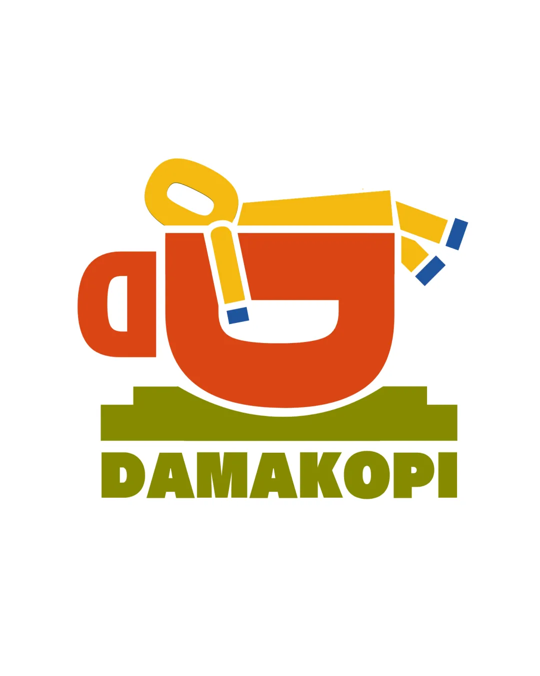
The DAMAKOPI logo features a vibrant coffee cup as its central symbol, creatively topped by a relaxed yellow figure suggesting comfort and leisure. This playful illustration is paired with a bold, olive green geometric wordmark, emphasizing strength and approachability. The vivid orange, olive, and yellow color scheme conveys warmth and invites a sense of welcome, making it ideal for a casual café setting. Strong lines and a modern, illustrative style establish a memorable brand identity. The overall composition effectively merges imagery of both coffee culture and relaxation, appealing directly to the target audience. Its versatile design ensures visibility across merchandise, signage, and digital platforms.

Tips for the logo presentation

Mockup ideas
  • Coffee shop signage above entry doors.
  • Cup sleeves and takeaway coffee cup labels.
  • Branded staff aprons or t-shirts.
  • Social media profile icon and page banner.
  • Menu covers or table signs.
  • Business cards and loyalty stamp cards.
  • Wall mural or window sticker in the café interior.
Try your own review

Wondering how your logo performs?

Get a clear logo score, key risks, and priority fix ideas before your client or audience sees it.

Review my logo




