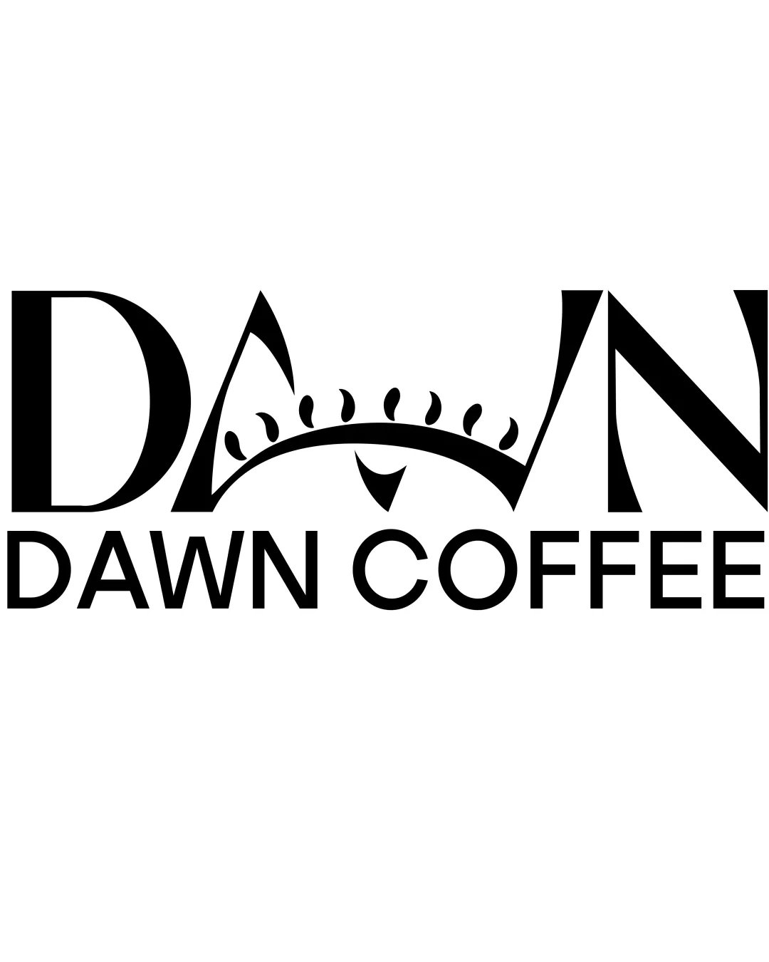
DAWN DAWN COFFEE logo review
4.0 / 5
Logo score
Logo review of

Dawn Dawn Coffee

A strong, memorable logo leveraging concept-driven integration; minor tweaks would enhance practical use and typographic balance.

Objective AI feedback. Your creative decision.

Combination Mark Modern Typographic With Illustrative Element Coffee Shop
4/5
Legibility
4/5
Originality
4/5
Misread
4/5
Balance
3.5/5
Scale
Action plan

What to fix first

The most important fixes to handle before polishing the full presentation.

1

Simplify the sun rays or increase spacing to ensure clarity at small sizes.

High priority

Tiny details in the rays risk blurring or disappearing in small formats.

Impact: Improves Scalability And Versatility For Real-world Applications. · Effort: Medium

2

Subtly adjust the spacing and integration of the sun motif with the 'A' for enhanced typographic harmony.

Medium priority

The flow between illustration and letters is slightly abrupt compared to the rest of the type.

Impact: Improves Wordmark Legibility And Overall Visual Cohesion. · Effort: Low

Detailed review

Logo performance breakdown

4/5

Legibility

Checkmark icon Main word 'DAWN' and 'DAWN COFFEE' are clear and easy to read.

Warning icon Slight complexity in the illustrative sun element may cause minor distraction at small sizes.

4/5

Originality

Checkmark icon Integrates sun motif into typography in a way distinctive for the coffee industry.

Warning icon Letterform manipulation is moderately common in industry; not highly unique.

4/5

Balance alignment

Checkmark icon Well-centered composition; sun motif balances the angular letterforms.

Warning icon The sun element makes the letter 'A' less prominent and slightly disrupts spacing between letters.

logo 200x250 pixels scalability test alignment grid overlay
3.5/5

Scalability

Checkmark icon Simple color scheme ensures reproduction on various backgrounds.

Warning icon Details in the sun rays may be lost at small sizes; illustration could collapse visually when reduced.

logo 200x250 pixels scalability test

200x250 px

logo 100x125 pixels scalability test

100×125 px

logo 50x62 pixels scalability test

50×62 px

4/5

Misinterpretations

Checkmark icon Sunrise concept reinforces the morning/coffee theme.

4 / 5

Logo structure & brief match

Checkmark icon The sun/rays illustration connects conceptually and visually with the wordmark.

Warning icon Transition between the illustrative and letter components could be smoother.

Checkmark icon Industry Fit: Strongly ties to coffee and morning with the dawn concept and black/white palette.

Checkmark icon Concept Fit: Effectively merges 'dawn' (sunrise) with the coffee theme for memorable branding.

Try your own review

Wondering how your logo performs?

Get a clear logo score, key risks, and priority fix ideas before your client or audience sees it.

Review my logo