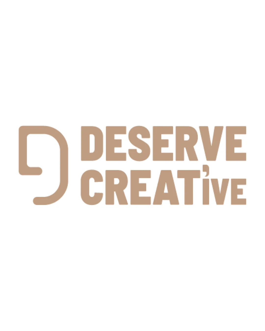
DESERVE CREATiVE logo review
3/5
Logo score
Logo review of

Deserve Creative

Competent execution but limited originality and minor balance issues hold it back from a distinctive, professional standard.

Combination Modern Sans-serif Wordmark With Abstract Mark Creative Services
3/5
Legibility
2/5
Originality
5/5
Misread
3/5
Balance
4/5
Scale
Your next steps

What to fix first

Focus on the changes that matter. Keep what makes the logo work.

1

Standalone mark

Redraw the symbol with a more unique or ownable construction.

Visible issue High priority Medium effort
Area to inspectApproximate location

The standalone mark is a generic rounded 'D' or chat bubble form, which is widely used and lacks distinctiveness.

How to check

Compare new artwork for a recognizable and exclusive silhouette.

See the category review
2

wordmark

Test alternative 'i' treatments that distinguish the letter clearly while keeping visual character.

Visible issue Medium priority Medium effort
Area to inspectApproximate location

The lowercase 'i' in 'CREATiVE' uses a stylized comma or accent instead of a standard dot, which could be misread or distract from the text at a glance.

How to check

Ensure that 'CREATiVE' reads legibly at small sizes and in quick passes.

See the category review
Detailed review

Logo performance breakdown

3/5

Brief & logo match

Based on an inferred industry
Compared with

Modern creative services inferred from the brand name and visual style.

The logo expresses creative professionalism but lacks a unique mark to stand out in its field.

  • Modern Professionalism

    The heavy sans-serif and geometric symbol aim for a bold, trustworthy look suitable for creative services.

  • Creativity & Distinction

    While the logomark attempts a creative form, its generic style limits brand differentiation.

3/5

Legibility

  • Overall text is bold and mostly readable.
  • The lowercase 'i' in 'CREATiVE' uses a stylized comma or accent instead of a standard dot, which could be misread or distract from the text at a glance.

    Visible issue wordmark

    Try: Test alternative 'i' treatments that distinguish the letter clearly while keeping visual character.

    Check: Ensure that 'CREATiVE' reads legibly at small sizes and in quick passes.

    Area to inspectApproximate location
2/5

Originality

  • The standalone mark is a generic rounded 'D' or chat bubble form, which is widely used and lacks distinctiveness.

    Visible issue Standalone mark

    Try: Redraw the symbol with a more unique or ownable construction.

    Check: Compare new artwork for a recognizable and exclusive silhouette.
    Area to inspectApproximate location
3/5

Balance alignment

  • Bold composition, nearly balanced.
  • The spacing between the standalone mark and the wordmark feels tight compared to internal text spacing, slightly crowding the logo.

    Optional refinement wordmark

    Try: Increase the gap between the mark and the text for improved clarity and proportion.

    Check: Verify visual breathing room without disconnecting the elements.

Uploaded logoAlignment guide overlay

Inspect spacing with the guide. Optical balance may differ from geometric centering.

4/5

Scalability

  • Thick lines and simple geometry will reproduce well.
Uploaded logo at 200 pixels wide
200 × 250 px
Uploaded logo at 100 pixels wide
100 × 125 px
Uploaded logo at 50 pixels wide
50 × 63 px

Compare the detail at different sizes. Labels show the full image dimensions.

5/5

Misinterpretations

  • No negative or inappropriate associations visible.
4/5

Symbol & text fit

  • Stylistic coherence between the mark and text.

Black & white

Does the shape still work without color?

These tests are available only for logos uploaded in vector (SVG) format.

Background contrast

Find the surfaces where your logo stays clear.

These tests are available only for logos uploaded in vector (SVG) format.

Blur & silhouette

A 3px blur softens fine details so you can check whether the overall shape stays recognizable. If key gaps close or elements merge, the logo may rely too heavily on detail.

These tests are available only for logos uploaded in vector (SVG) format.

Try your own review

Wondering how your logo performs?

Get a clear logo score, key risks, and priority fix ideas before your client or audience sees it.

Review my logo