 View review
Logo score
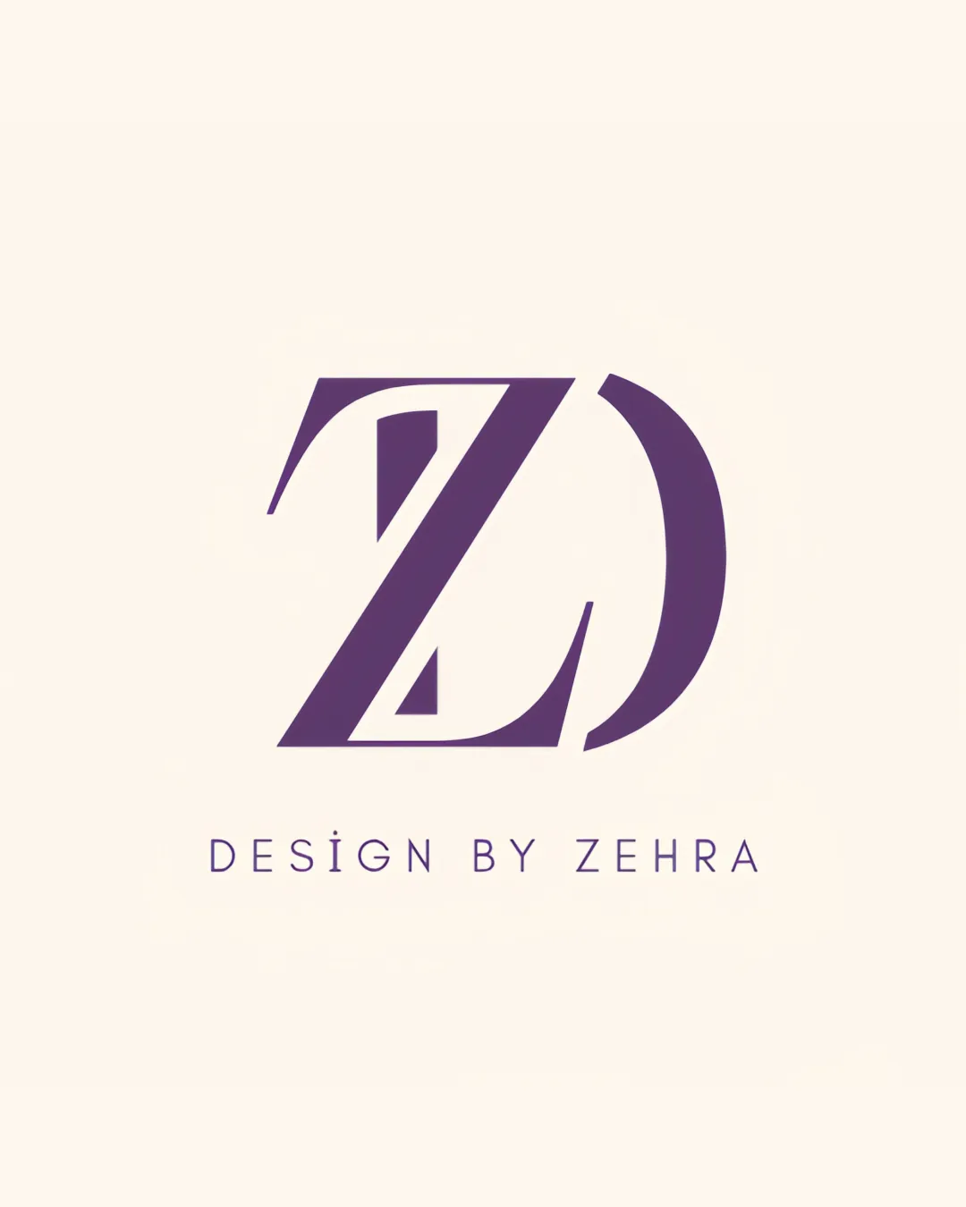
Logo review ofDesign By Zehra
Review the detailed scores below to see what is working and what should be refined first.
Legibility
Originality
Misread
Balance
Scale
Detailed review
Logo performance breakdown
Legibility
![]() The wordmark 'DESIGN BY ZEHRA' is clear and easy to read.
The wordmark 'DESIGN BY ZEHRA' is clear and easy to read.![]() Simple, sans-serif font selection aids legibility.
Simple, sans-serif font selection aids legibility.
![]() The 'I' with the dot in DESIGN stands out, which could potentially cause brief confusion.
The 'I' with the dot in DESIGN stands out, which could potentially cause brief confusion.![]() Overlapping Z and D in the monogram may require a second glance to recognize the letters.
Overlapping Z and D in the monogram may require a second glance to recognize the letters.
Originality
![]() Strong integration of initials into a creative, geometric monogram.
Strong integration of initials into a creative, geometric monogram.![]() Negative space is effectively utilized to abstractly reference the letters.
Negative space is effectively utilized to abstractly reference the letters.
![]() Initial-based monograms are common in the design industry; differentiation mostly comes from execution here rather than concept.
Initial-based monograms are common in the design industry; differentiation mostly comes from execution here rather than concept.
Color harmony
![]() Monochromatic color scheme maintains harmony and sophistication.
Monochromatic color scheme maintains harmony and sophistication.![]() The color contrast between monogram/wordmark and background ensures visibility.
The color contrast between monogram/wordmark and background ensures visibility.
Eminence
#563268
Chalk
#F7F1E5
Balance alignment
![]() Monogram and wordmark are centrally aligned, creating a cohesive visual hierarchy.
Monogram and wordmark are centrally aligned, creating a cohesive visual hierarchy.![]() Spacing between symbol and wordmark is appropriate.
Spacing between symbol and wordmark is appropriate.
![]() The curve of the 'D' slightly outweighs the sharpness of the 'Z', leading to a slight feeling of imbalance.
The curve of the 'D' slightly outweighs the sharpness of the 'Z', leading to a slight feeling of imbalance.

Scalability
![]() Monogram is bold and should scale well for larger applications such as signage or packaging.
Monogram is bold and should scale well for larger applications such as signage or packaging.![]() Few fine details allow for good reproduction in medium sizes.
Few fine details allow for good reproduction in medium sizes.
![]() The thin lines and internal cutouts within the monogram might become less legible at very small sizes, such as app icons or embroidery.
The thin lines and internal cutouts within the monogram might become less legible at very small sizes, such as app icons or embroidery.
200x250 px
100×125 px
50×62 px
Misinterpretations
![]() Logo does not contain any inappropriate secondary interpretations.
Logo does not contain any inappropriate secondary interpretations.
Symbol & text fit
![]() The style of the wordmark pairs well with the monogram, both reflecting a modern, minimal aesthetic.
The style of the wordmark pairs well with the monogram, both reflecting a modern, minimal aesthetic.
![]() Proportional sizing between logomark and wordmark is on point.
Proportional sizing between logomark and wordmark is on point.
Try your own review
Review my logo
Wondering how your logo performs?
Get a clear logo score, key risks, and priority fix ideas before your client or audience sees it.
Keep exploring


