View review
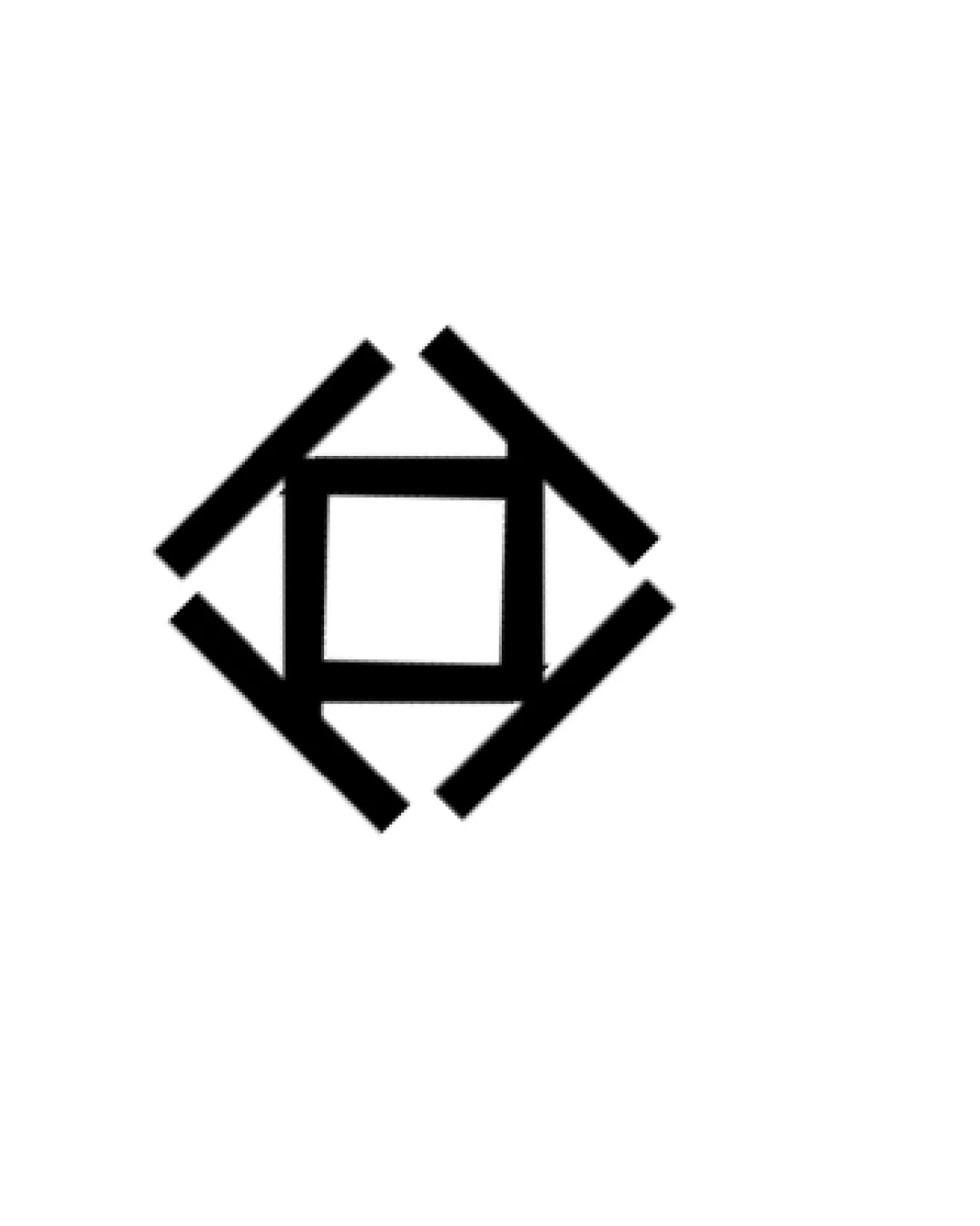
Diamond Shaped Abstract Geometric Form With Inters..
Review the detailed scores below to see what is working and what should be refined first.
Objective AI feedback. Your creative decision.
Logo performance breakdown
Originality
Minimalist structure attempts a unique geometric approach.
Some use of negative space to form a central shape.
Abstract geometric logos are highly common, resulting in a lack of distinctiveness.
No brand- or industry-specific features stand out, causing potential for genericism.

Color harmony
Limited to black and white, ensuring maximum contrast and adaptability across backgrounds.
Black
#000000
White
#FFFFFF
Balance alignment
Geometric alignment creates a visually stable form.
Symmetry enhances perceived balance.
Perceptual imbalance may occur if lines are not perfectly equidistant or if the thickness is not consistent on all parts.
Scalability
Simple and bold lines maintain clarity at small sizes.
Works well for favicons, app icons, and business cards.
Can be easily embroidered or printed on various surfaces.
May lose distinctiveness or appear overly generic on large formats like billboards or signage due to lack of detail or brand-specific elements.
200x250 px
100×125 px
50×62 px
Misinterpretations
No obvious inappropriate or confusing dual meanings detected.
Wondering how your logo performs?
Get a clear logo score, key risks, and priority fix ideas before your client or audience sees it.