View review
Logo score
Logo review of
Digital Publish
Review the detailed scores below to see what is working and what should be refined first.
Objective AI feedback. Your creative decision.
Legibility
Originality
Misread
Balance
Scale
Detailed review
Logo performance breakdown
Legibility
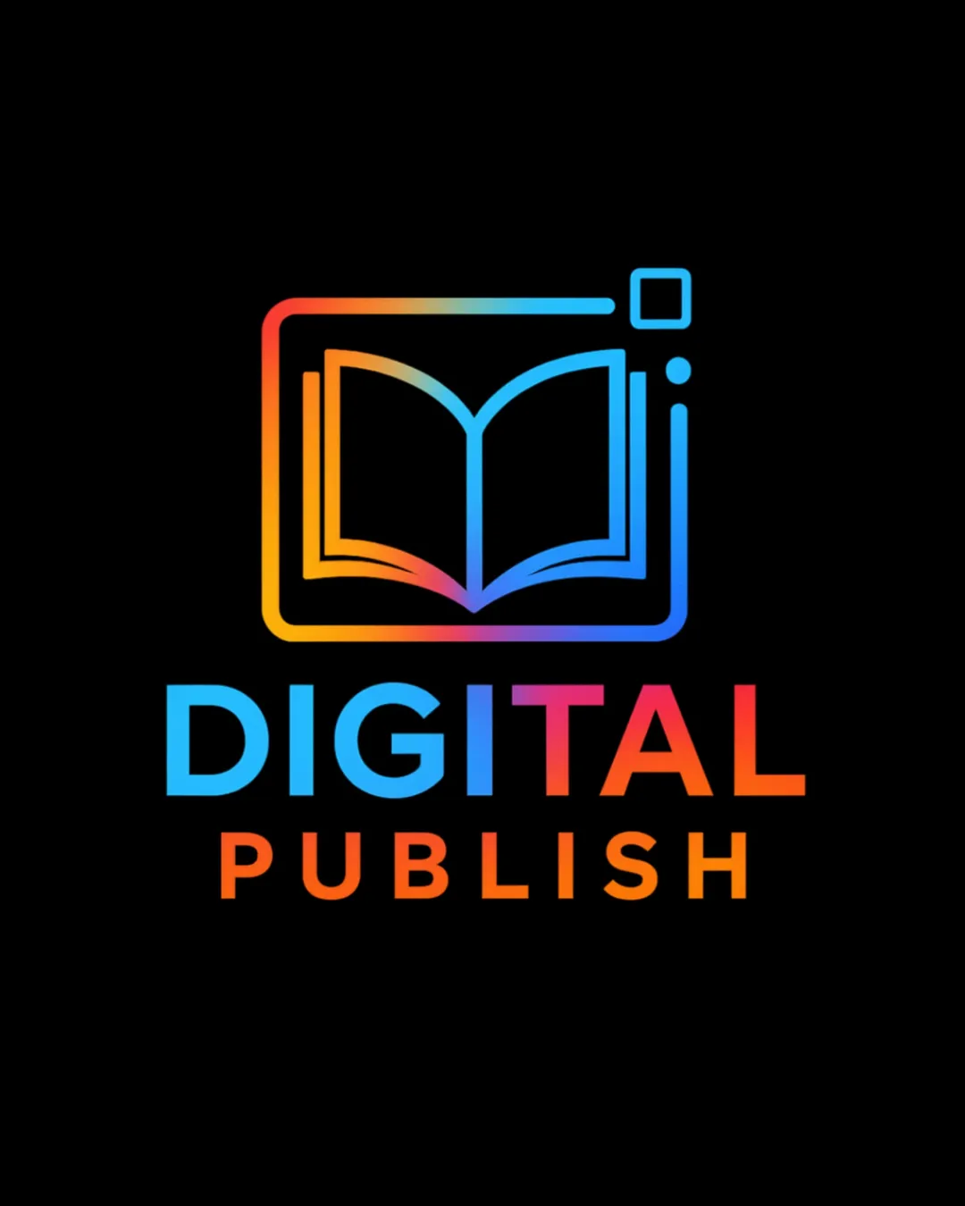
 Text is clear, bold, and easily readable against the dark background Consistent and modern sans-serif typeface enhances readability
 Color gradient on 'DIGITAL' slightly reduces clarity for quick scanning, especially between light yellow and pink zones
Originality
Book within a digital screen motif is relevant to the brand's sector and conveyance Gradient coloring adds a modern tech-inspired flair
Book and digital frame concept is common for digital publishing and edtech industries, lacking true distinctiveness The small squares and dots are generic UI elements
Color harmony
Bright gradient integrates orange, blue, and purple smoothly for a dynamic look Vibrant tones communicate tech-forward ethos
Multiple color zones could reduce versatility and risk color issues on different backgrounds
Picton Blue
#29B6F6
Orange
#FB8C00
Violet
#E040FB
Yellow
#FFD600
Black
#000000
Your palette is close. Refine the color roles and combinations before updating the logo.
Build brand colorsBalance alignment
Good visual weight distribution between icon and logotype Elements are well-centered with carefully aligned text
Icon's upper right elements (dots, square) feel slightly detached, weakening icon unity at first glance

Scalability
Minimalist icon design supports scalability Elements remain identifiable at moderate sizes like social media avatars and app icons
Thin line weights and color gradients may lose impact and clarity when reproduced very small (e.g., favicon or embroidery) Gradient detail complicates usage on some print materials and promotional merchandise
200x250 px
100×125 px
50×62 px
Misinterpretations
No inappropriate or accidental imagery is detected
Symbol & text fit
Both icon and wordmark employ matching gradients, making them visually cohesive
Modern sans-serif typeface fits well with the tech-inspired iconography
Try your own review
Review my logo
Wondering how your logo performs?
Get a clear logo score, key risks, and priority fix ideas before your client or audience sees it.
Keep exploring