 View review
Logo score
Logo review of
Digizen Graphics Hub
Review the detailed scores below to see what is working and what should be refined first.
Objective AI feedback. Your creative decision.
Legibility
Originality
Misread
Balance
Scale
Detailed review
Logo performance breakdown
Legibility
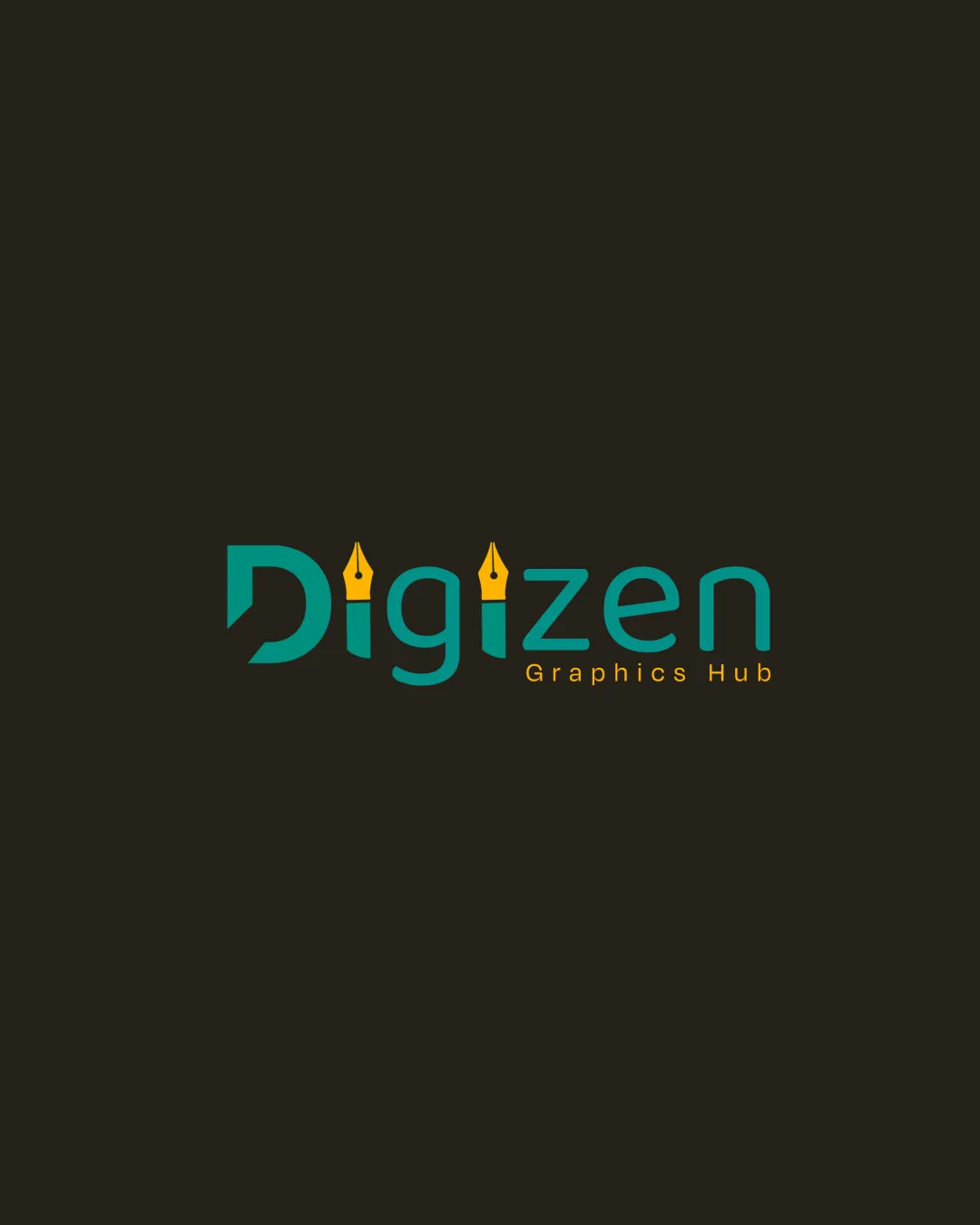
 Primary wordmark 'Digizen' is easily readable Supporting text 'Graphics Hub' is distinct and clear
 Pen nibs as dots on the 'i's could potentially cause minor confusion, especially at smaller sizes
Originality
Creative integration of pen nib motif into the wordmark Custom letter treatment for industry relevance
Pen nib icon is fairly common in design/creative industries, so this motif is not highly unique
Color harmony
Strong contrast between teal, orange-yellow, and black for clear visibility Limited color palette reinforces brand cohesion
Saturation difference between the teal and orange may look less harmonious on different backgrounds
Persian Green
#029C8B
Sunglow
#FFC417
Bunker
#222016
Your palette is close. Refine the color roles and combinations before updating the logo.
Build brand colorsBalance alignment
Overall horizontal alignment is consistent and visually steady Spacing between characters is generally even
The orange subtext is right-aligned and slightly disconnected from the main wordmark

Scalability
Bold and simple forms of main text support decent scalability Would work well on digital applications and large-format banners
Pen nib details could be lost or unrecognizable at very small sizes (e.g., favicon, embroidery) 'Graphics Hub' in smaller text may become illegible at small scales
200x250 px
100×125 px
50×62 px
Misinterpretations
No unintentional inappropriate or confusing imagery detected
Try your own review
Review my logo
Wondering how your logo performs?
Get a clear logo score, key risks, and priority fix ideas before your client or audience sees it.
Keep exploring


