Wondering how your logo performs? 🧐
Get professional logo reviews in seconds and catch design issues in time.
Try it Now!Logo review of DINSOS Provinsi Jawa Tengah
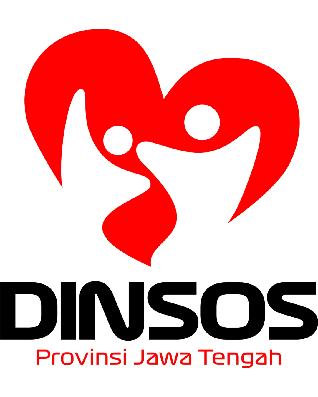
 Logo analysis by AI
Logo type:
Style:
Detected symbol:
Negative space:
Detected text:
Business industry:
Review requested by Faizalyherm
**If AI can recognize or misinterpret it, so can people.
Structured logo review
Legibility
Sans-serif font enhances readability
High contrast between text and background
The smaller text may reduce readability when scaled down
Scalability versatility
Simple shapes allow for decent scalability
Works well on digital platforms
Complexity of figures inside the heart might lose detail in small applications

200x250 px

100×125 px

50×62 px
Balance alignment
Good visual balance between symbol and text
Center alignment of elements creates cohesive look


Originality
Creative use of human figures and heart symbolism
Unique representation for social services sector
Heart with figures is a somewhat common design theme
Logomark wordmark fit
Fits well conceptually with the organization's mission
Aesthetic look
Vibrant color scheme
Clean and modern aesthetics
The overall shape might appear slightly busy
Dual meaning and misinterpretations
Positive and clear representation
Color harmony
Good use of harmonious red tones
Effective contrast


