View review
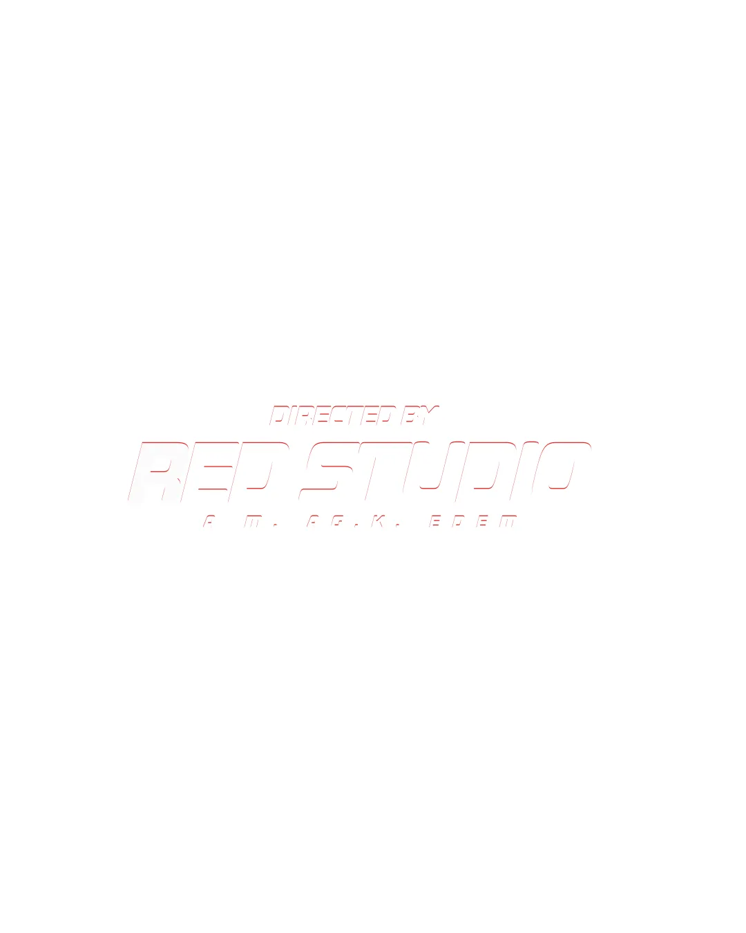
Directed By Red Studio
The concept is directionally sound for a creative studio, but drastic contrast, color, and stroke adjustments are essential for practical and professional readiness.
Objective AI feedback. Your creative decision.
What to fix first
The most important fixes to handle before polishing the full presentation.
Drastically increase color contrast (thicker strokes and darker or bolder colors) for the wordmark and subtitle text.
High priorityCurrent faint styling is unreadable and fails professionalism standards.
Impact: Makes The Logo Visible, Legible, And Usable In Both Digital And Print Settings. · Effort: Medium
Test scalability at various sizes and tweak for consistent visibility.
Medium priorityThin outlines and pale colors collapse at small scales.
Impact: Ensures Usability Across Print, Web, And Motion Applications. · Effort: Low
Logo performance breakdown
Legibility
Distinct spacing between major words.
Extremely low contrast makes the text hard to read on a white background.
Thin lines and pale red outline further hinder readability.
Originality
Futuristic italic styling adds some uniqueness.
Typography is otherwise fairly standard for modern wordmarks without strong differentiation.
Color harmony
Red accent is appropriate for 'RED STUDIO'.
Ultra-light application against white background destroys readability and visual impact.
White
#FFFFFF
Light Red
#F88379
Color may be holding this logo back. Build a stronger strategic palette before updating the logo.
Build brand colorsBalance alignment
Consistent letter sizing and alignment convey modernity.
Upper and lower subtitle text lack visual weight compared to central wordmark, causing imbalance.
Scalability
Simple geometric structure would scale if higher-contrast.
Poor contrast and very thin strokes become invisible or unreadable at small sizes.
200x250 px
100×125 px
50×62 px
Misinterpretations
No obvious secondary or inappropriate meanings.
Brief match
Industry Relevance: Futuristic, italic styling fits well for a media or creative studio but fails on basic visibility needs.
Wondering how your logo performs?
Get a clear logo score, key risks, and priority fix ideas before your client or audience sees it.




