 View review
Logo score
Logo review of
Dmg
Review the detailed scores below to see what is working and what should be refined first.
Objective AI feedback. Your creative decision.
Legibility
Originality
Misread
Balance
Scale
Detailed review
Logo performance breakdown
Legibility
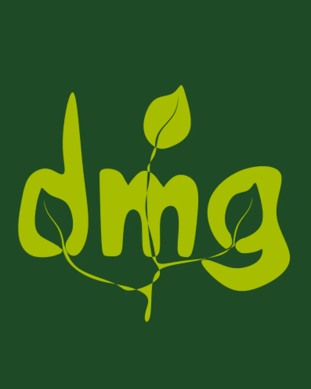
 Text has a playful and organic style.
 Leaf elements slightly disrupt the legibility.
Originality
Creative use of leaves integrated into text.
Color harmony
Colors are harmonious and fitting for the industry.
Your palette is close. Refine the color roles and combinations before updating the logo.
Build brand colorsBalance alignment
Good overall balance with even weight distribution.

Scalability
Simple color palette enhances scalability.
Thin leaf elements may lose clarity in smaller sizes.
200x250 px
100×125 px
50×62 px
Misinterpretations
Try your own review
Review my logo
Wondering how your logo performs?
Get a clear logo score, key risks, and priority fix ideas before your client or audience sees it.
Keep exploring


