Drink WITH US logo review
3.9 / 5
Logo score
Logo review of

Drink With Us

Not yet fully client-ready—refinement needed for clearer recognition and stronger regional tie.

Combination Mark Playful Hand-drawn Beverage
4/5
Legibility
3/5
Originality
5/5
Misread
4/5
Balance
4/5
Scale
Action plan

What to fix first

The most important fixes to handle before polishing the full presentation.

1

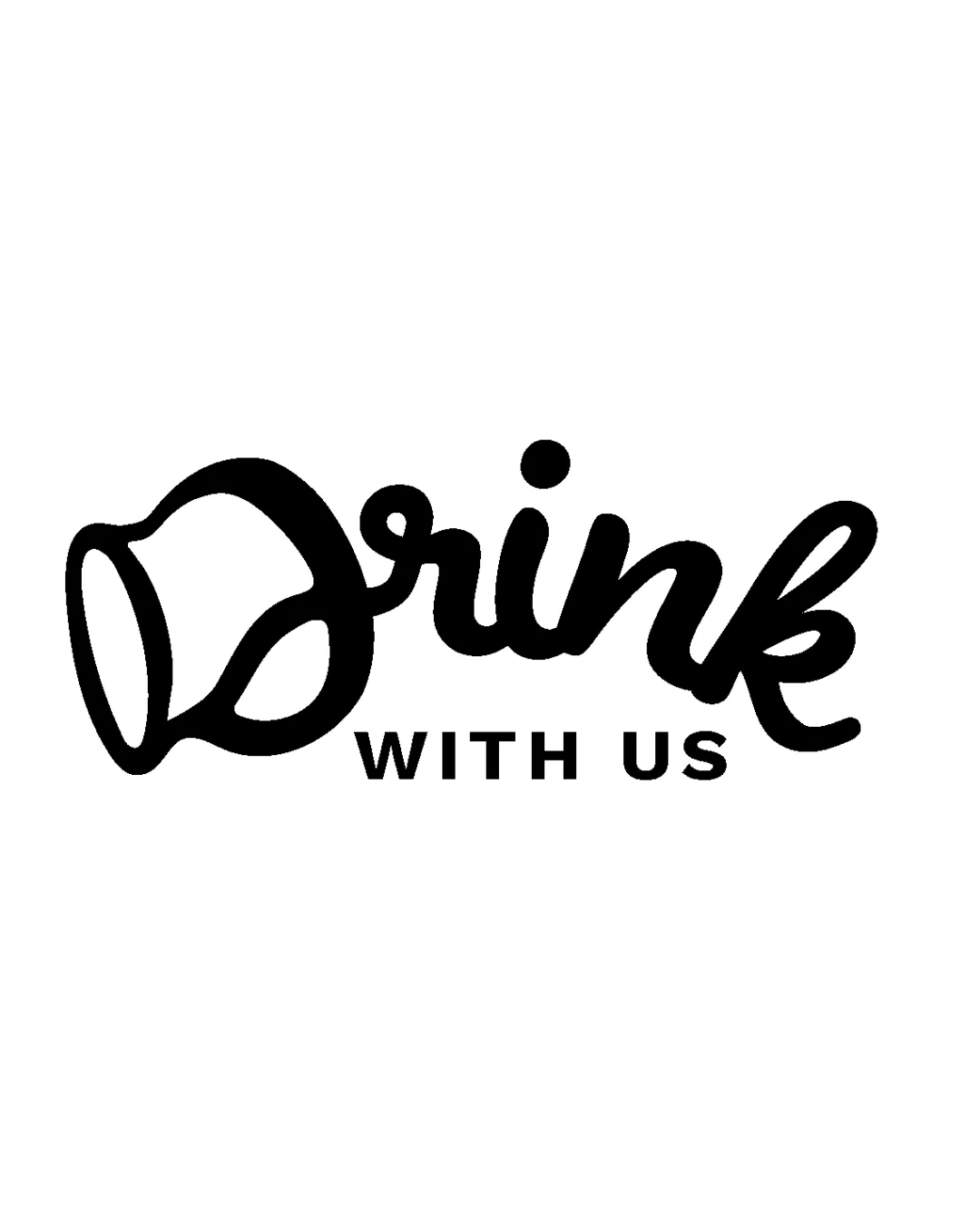
Refine the 'D' mug integration for faster letter recognition while preserving the mug concept.

High priority

Currently the 'D' may not be instantly recognized, which affects readability and brand recall.

Impact: Medium · Effort: Medium

2

Explore a subtle color accent or wine-related detail to add unique identity and reinforce Oregon Wine Country context.

Medium priority

Helps brand stand out more and connect visually to wine industry and location.

Impact: Medium · Effort: Medium

Detailed review

Logo performance breakdown

4/5

Legibility

Checkmark icon 'WITH US' is clear and readable in sans-serif.
Checkmark icon Script 'Drink' is mostly readable.

Warning icon The 'D' in 'Drink' takes a second to recognize due to the mug integration.

3/5

Originality

Checkmark icon Mug-D integration adds personality.

Warning icon Drink/mug themes are common; execution is playful but not highly distinctive.

4/5

Color harmony

Checkmark icon Simple black is bold and direct; easy to adapt.

Warning icon Single color lacks depth; may benefit from a supporting color accent.

Black
#000000

Your palette is close. Refine the color roles and combinations before updating the logo.

Build brand colors
4/5

Balance alignment

Checkmark icon The arrangement is visually balanced horizontally.
Checkmark icon 'WITH US' anchors the script above.

Warning icon There is some visual weight imbalance between the thick mug D and lighter wordmark below.

logo 200x250 pixels scalability test alignment grid overlay
4/5

Scalability

Checkmark icon Bold strokes support scaling.
Checkmark icon Works well in one color.

Warning icon Hand-drawn script may lose clarity in very small sizes.

logo 200x250 pixels scalability test

200x250 px

logo 100x125 pixels scalability test

100×125 px

logo 50x62 pixels scalability test

50×62 px

5/5

Misinterpretations

Checkmark icon No inappropriate or confusing misreads.

4 / 5

Logo structure & brief match

Checkmark icon The mug-D and script integrate well with supporting sans-serif text.

Warning icon Mug shape slightly complicates word flow.

Checkmark icon Online And Social Media For Promoting Oregon Wine Country: Tone is fun and casual, which fits well for engagement-driven beverage/social content, but script and mug style do not directly signal wine or regional specificity.

Try your own review

Wondering how your logo performs?

Get a clear logo score, key risks, and priority fix ideas before your client or audience sees it.

Review my logo