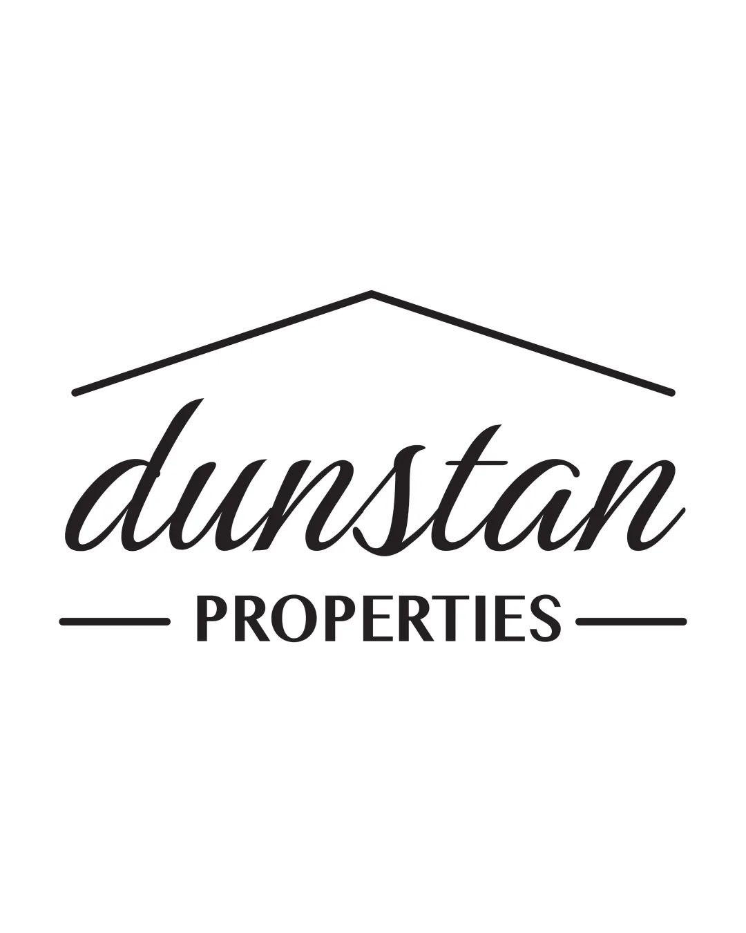
dunstan PROPERTIES logo review
3.5 / 5
Logo score
Logo review of

Dunstan Properties

Solid, functional real estate logo but would benefit from greater originality to stand out in a crowded market.

Objective AI feedback. Your creative decision.

Combination Mark Classic And Clean, Script And Sans-serif Real Estate
4/5
Legibility
3/5
Originality
5/5
Misread
4/5
Balance
3.5/5
Scale
Action plan

What to fix first

The most important fixes to handle before polishing the full presentation.

1

Increase distinctiveness of the roofline or add a unique design twist.

High priority

Many real estate logos use similar roof imagery.

Impact: Will Help Differentiate From Generic Real Estate Brands. · Effort: Medium

2

Test small-size reproduction, especially of the script wordmark.

Medium priority

Script style can blur at small sizes.

Impact: Ensures Clarity Across All Applications. · Effort: Low

Detailed review

Logo performance breakdown

4/5

Legibility

Checkmark icon Both 'dunstan' and 'PROPERTIES' are readable; hierarchy is clear.

Warning icon Script 'dunstan' may lose some legibility at smaller sizes.

3/5

Originality

Checkmark icon Roof motif is relevant to real estate.

Warning icon Roofline concept is common in property logos; lacks distinctive twist.

4/5

Balance alignment

Checkmark icon Centered layout and roofline provide structure.
Checkmark icon Balanced word-to-mark relationship.

Warning icon Minor space imbalance between top line and lower elements.

logo 200x250 pixels scalability test alignment grid overlay
3.5/5

Scalability

Checkmark icon Simple, bold marks reproduce well.

Warning icon Roofline and script may lose crispness at very small sizes; moderate detail in the script.

logo 200x250 pixels scalability test

200x250 px

logo 100x125 pixels scalability test

100×125 px

logo 50x62 pixels scalability test

50×62 px

5/5

Misinterpretations

Checkmark icon No negative or confusing readings detected.

4 / 5

Logo structure & brief match

Checkmark icon Roofline fits well above the wordmark, creating a unified real estate feel.

Checkmark icon Real Estate: Clear visual tie to housing; script and sans-serif balance professionalism and approachability.

Try your own review

Wondering how your logo performs?

Get a clear logo score, key risks, and priority fix ideas before your client or audience sees it.

Review my logo