Wondering how your logo performs? 🧐
Get professional logo reviews in seconds and catch design issues in time.
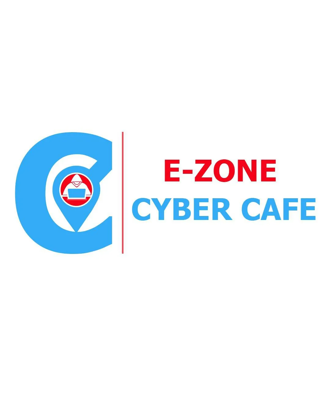
Try it Now!Logo review of E-ZONE CYBER CAFE
 Logo analysis by AI
Logo type:
Style:
Detected symbol:
Detected text:
Business industry:
Review requested by Jamaason123
**If AI can recognize or misinterpret it, so can people.
Structured logo review
Legibility
![]() Text is bold and clear with high contrast on a white background
Text is bold and clear with high contrast on a white background![]() Font choice is straightforward and readable at most sizes
Font choice is straightforward and readable at most sizes
![]() Color contrast between 'CYBER CAFE' (light blue) and white could be slightly weak on poor quality screens or when scaled down
Color contrast between 'CYBER CAFE' (light blue) and white could be slightly weak on poor quality screens or when scaled down
Scalability versatility
![]() Simple enough to be used in digital contexts and larger signage
Simple enough to be used in digital contexts and larger signage
![]() Inner icon (computer and envelope) is too detailed for small-size applications such as favicons, app icons, or embroidery on uniforms
Inner icon (computer and envelope) is too detailed for small-size applications such as favicons, app icons, or embroidery on uniforms![]() Thin red separator line may disappear at small scales
Thin red separator line may disappear at small scales
200x250 px
100×125 px
50×62 px
Balance alignment
![]() Overall left-right alignment is visually clear due to the vertical divider
Overall left-right alignment is visually clear due to the vertical divider
![]() Large 'C' symbol overpowers text visually, creating imbalance
Large 'C' symbol overpowers text visually, creating imbalance![]() Text block alignment with the mark feels disconnected due to the thin red line
Text block alignment with the mark feels disconnected due to the thin red line

Originality
![]() Literal symbol use communicates internet/cyber theme instantly
Literal symbol use communicates internet/cyber theme instantly
![]() Uses highly generic and overused symbols (location pin, envelope, computer)
Uses highly generic and overused symbols (location pin, envelope, computer)![]() No unique twist or integration on standard iconography
No unique twist or integration on standard iconography![]() Generic combination reduces memorability
Generic combination reduces memorability
Logomark wordmark fit
![]() Color usage is somewhat consistent
Color usage is somewhat consistent
![]() The bold, geometric logo mark does not match the relatively plain, sans-serif wordmark style
The bold, geometric logo mark does not match the relatively plain, sans-serif wordmark style![]() The mark and text are mismatched in scale and visual weight
The mark and text are mismatched in scale and visual weight
Aesthetic look
![]() Colors are visually appealing and vibrant for a digital brand
Colors are visually appealing and vibrant for a digital brand![]() Overall, design is visually clean
Overall, design is visually clean
![]() Literal, multi-symbol mark feels overcrowded and busy
Literal, multi-symbol mark feels overcrowded and busy![]() Design lacks subtlety or smart reduction common in quality logos
Design lacks subtlety or smart reduction common in quality logos
Dual meaning and misinterpretations
![]() No inappropriate accidental symbols or misleading shapes
No inappropriate accidental symbols or misleading shapes
Color harmony
![]() Limited to three strong, cohesive colors creating visual focus
Limited to three strong, cohesive colors creating visual focus
![]() Red/blue split could feel visually aggressive when applied to some branded collateral
Red/blue split could feel visually aggressive when applied to some branded collateral
Cyan
#4CC2F3
Red
#E82929
White
#FFFFFF