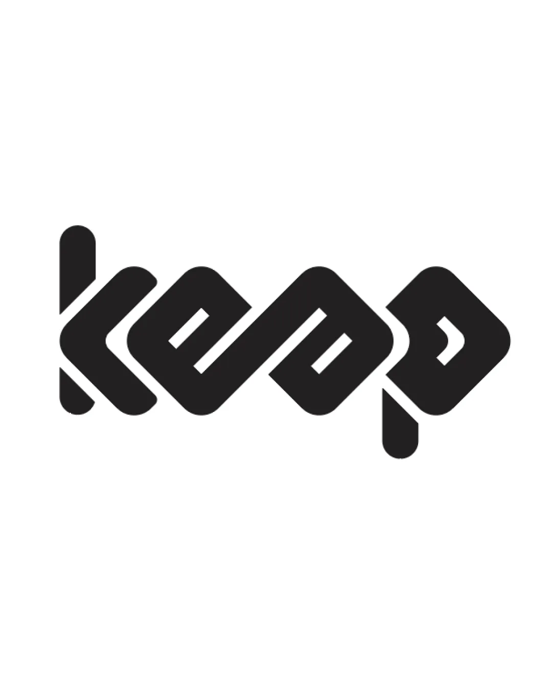
KEEP logo review
3.9 / 5
Logo score
Logo review of

Keep

Review the detailed scores below to see what is working and what should be refined first.

Objective AI feedback. Your creative decision.

Wordmark Modern, Geometric, Abstract Tech
2/5
Legibility
5/5
Originality
4/5
Misread
4/5
Balance
3/5
Scale
Action plan

What to fix first

The most important fixes to handle before polishing the full presentation.

1

Fix possible misinterpretation

High priority

The severe abstraction may cause confusion and disconnect from the intended word
Impact: High · Effort: Medium

Detailed review

Logo performance breakdown

2/5

Legibility

Checkmark icon Consistent line weight throughout the wordmark
Checkmark icon Distinct shapes for each letter

Warning icon The geometric abstraction makes the letterforms difficult to read at first glance
Warning icon 'K', 'E', 'E', 'P' are not immediately distinguishable to general audiences
Warning icon Potential confusion for non-designers, especially in small sizes or at a distance

5/5

Originality

Checkmark icon Unconventional combination of abstract geometry and letterforms
Checkmark icon Distinctive and unique visual execution not reminiscent of generic wordmarks
Checkmark icon Abstract interpretation delivers a memorable identity

5/5

Color harmony

Checkmark icon Restrained monochrome palette maximizes versatility and avoids distraction
Checkmark icon High contrast ensures strong visibility on light backgrounds

Black
#000000

White
#FFFFFF

4/5

Balance alignment

Checkmark icon Visual weight is distributed evenly from left to right
Checkmark icon Consistent spacing and alignment of diagonal and vertical elements

Warning icon The lower extension on the final 'P' breaks alignment along the baseline, slightly disrupting horizontal balance
Warning icon The line endings and disjointed segments might appear visually disjointed

logo 200x250 pixels scalability test alignment grid overlay
3/5

Scalability

Checkmark icon Solid, bold shapes ensure that the mark will not lose elements at small scale
Checkmark icon High contrast with background

Warning icon Letter abstraction reduces legibility at smaller sizes, making the logo harder to recognize on thumbnails, app icons, or business cards
Warning icon Complex interwoven structure may blur when minimized or embroidered on fabric

logo 200x250 pixels scalability test

200x250 px

logo 100x125 pixels scalability test

100×125 px

logo 50x62 pixels scalability test

50×62 px

4/5

Misinterpretations

Checkmark icon No overtly inappropriate or suggestive forms
Checkmark icon Abstract shapes evoke linking or continuity which suits 'keep'

Warning icon The severe abstraction may cause confusion and disconnect from the intended word

Try your own review

Wondering how your logo performs?

Get a clear logo score, key risks, and priority fix ideas before your client or audience sees it.

Review my logo