Wondering how your logo performs? 🧐
Get professional logo reviews in seconds and catch design issues in time.
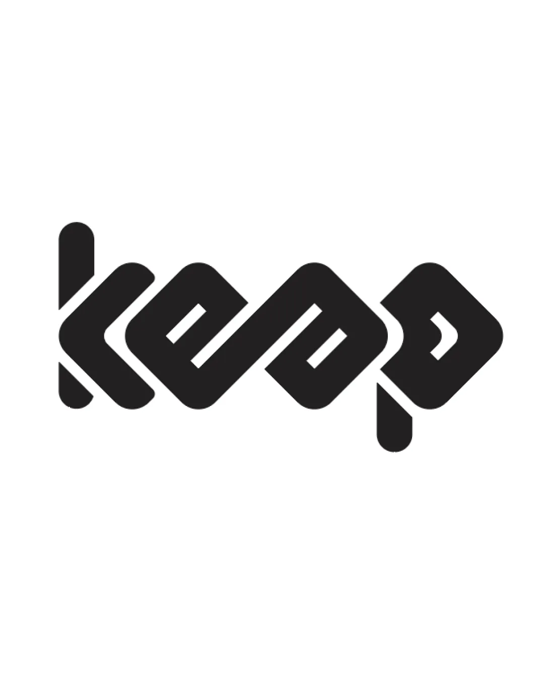
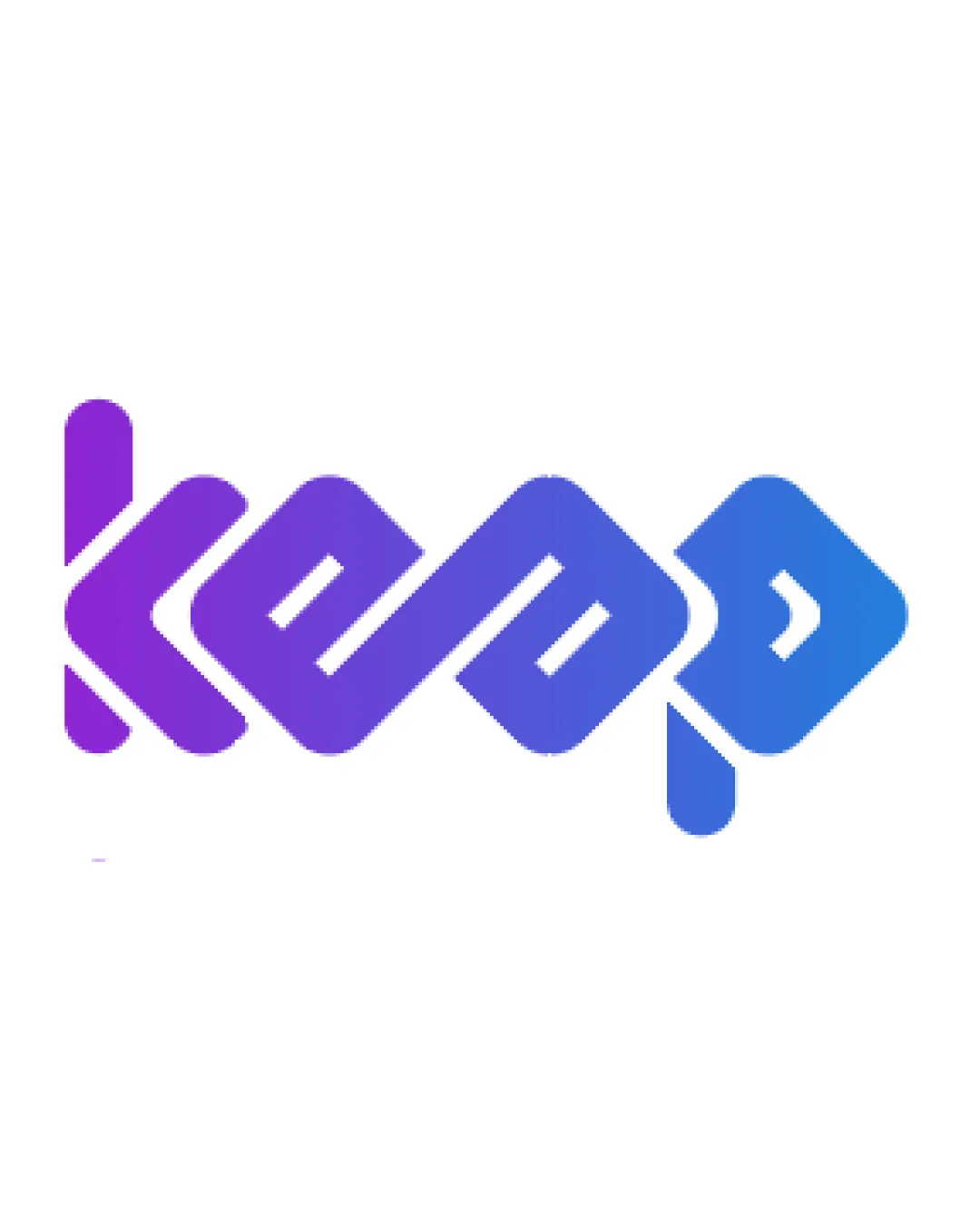
Try it Now!Logo review of keep
 Logo analysis by AI
Logo type:
Style:
Detected symbol:
Detected text:
Business industry:
Review requested by Fernando_Marcelino
**If AI can recognize or misinterpret it, so can people.
Structured logo review
Legibility
![]() The letters are mostly distinct when viewed at larger sizes.
The letters are mostly distinct when viewed at larger sizes.![]() Continuous flow and rhythm create a visually unified mark.
Continuous flow and rhythm create a visually unified mark.
![]() Some letterforms are ambiguous at first glance—especially the 'k' and 'p', which may cause readability issues.
Some letterforms are ambiguous at first glance—especially the 'k' and 'p', which may cause readability issues.![]() The geometric linking between letters can create visual confusion if read quickly or at small sizes.
The geometric linking between letters can create visual confusion if read quickly or at small sizes.
Scalability versatility
![]() The bold, weighty lines should reproduce well on large formats such as billboards and digital displays.
The bold, weighty lines should reproduce well on large formats such as billboards and digital displays.
![]() Fine details and the interconnected ribbon effect may blur or lose clarity at small scales, such as on mobile app icons, favicons, or embroidery.
Fine details and the interconnected ribbon effect may blur or lose clarity at small scales, such as on mobile app icons, favicons, or embroidery.![]() The gradient may not reproduce cleanly across all mediums, lowering versatility for monochrome or single-color applications.
The gradient may not reproduce cleanly across all mediums, lowering versatility for monochrome or single-color applications.
200x250 px
100×125 px
50×62 px
Balance alignment
![]() Visually balanced from left to right; the ribbon effect creates consistent weight distribution.
Visually balanced from left to right; the ribbon effect creates consistent weight distribution.![]() Letterforms are aligned on a baseline, aiding horizontal stability.
Letterforms are aligned on a baseline, aiding horizontal stability.
![]() The descender in the 'p' creates a slight visual imbalance compared to the rest of the composition.
The descender in the 'p' creates a slight visual imbalance compared to the rest of the composition.![]() Some angles in the connecting lines are slightly awkward, affecting optical flow.
Some angles in the connecting lines are slightly awkward, affecting optical flow.

Originality
![]() Unified, ribbon-inspired topology is visually unique.
Unified, ribbon-inspired topology is visually unique.![]() The merging of letterforms into a continuous path is creative and less common in wordmarks.
The merging of letterforms into a continuous path is creative and less common in wordmarks.
![]() Despite the unique approach, the geometric style and gradient are trending, making the mark look contemporary but not highly distinctive within tech branding.
Despite the unique approach, the geometric style and gradient are trending, making the mark look contemporary but not highly distinctive within tech branding.![]() No symbolic or negative space twist present to further reinforce originality.
No symbolic or negative space twist present to further reinforce originality.
Aesthetic look
![]() Good use of gradient adds visual interest without overwhelming the design.
Good use of gradient adds visual interest without overwhelming the design.![]() Smooth curves and consistent geometric language establish modernity.
Smooth curves and consistent geometric language establish modernity.
![]() Slightly over-stylized, which could impact legibility and practicality.
Slightly over-stylized, which could impact legibility and practicality.![]() No supporting icon or symbol for applications where a standalone mark would be beneficial.
No supporting icon or symbol for applications where a standalone mark would be beneficial.
Dual meaning and misinterpretations
![]() No inappropriate or misleading imagery detected in the composition.
No inappropriate or misleading imagery detected in the composition.
Color harmony
![]() Gradient transition between purple and blue is smooth and harmonious.
Gradient transition between purple and blue is smooth and harmonious.![]() Limited palette avoids visual clutter.
Limited palette avoids visual clutter.
Purple
#A343D7
Blue
#4377ED
White
#FFFFFF