View review
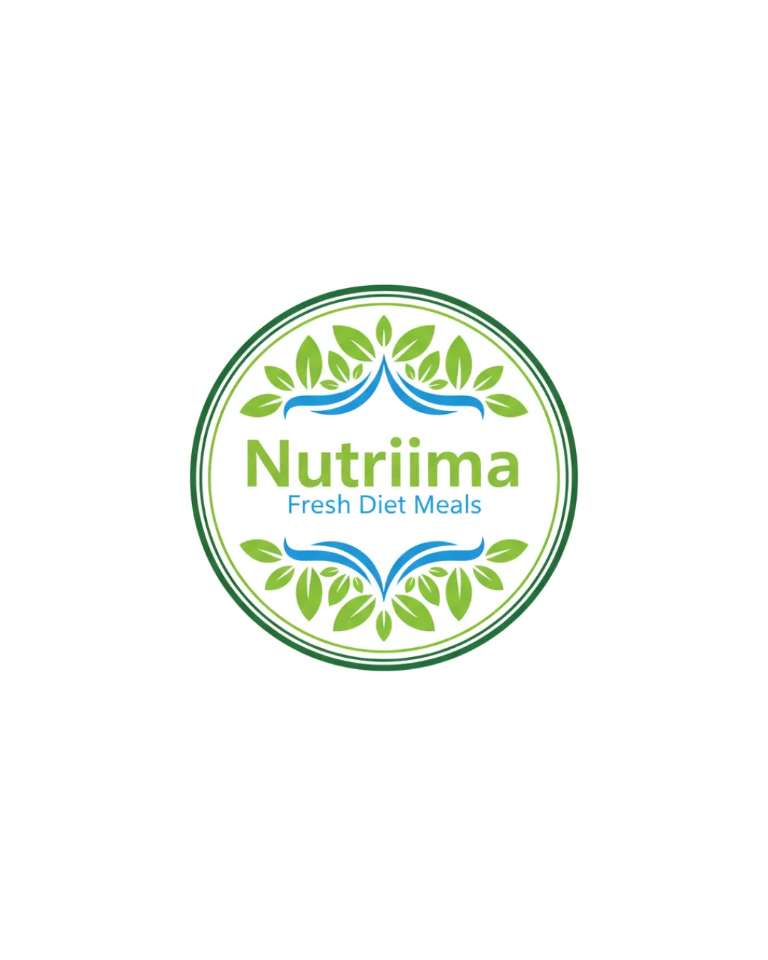
Nutriima, Fresh Diet Meals
Review the detailed scores below to see what is working and what should be refined first.
Objective AI feedback. Your creative decision.
Logo performance breakdown
Legibility
Primary brand name 'Nutriima' is clear and easy to read.
Tagline 'Fresh Diet Meals' is well-contrasted in blue against the white background.
Tagline may become less legible at very small sizes due to thin and lighter font weight relative to the rest of the mark.

Originality
Combination of leaves and blue swoosh adds organic and fresh cues.
Leaf motifs and circular emblem are highly generic and widely used within the health/food industry.
No unique or innovative visual twist; overall look feels somewhat templated.
Color harmony
Color choices are harmonious and reinforce the healthy/fresh theme.
Limited to three main colors, maintaining visual consistency.
Blue swoosh may seem out of place in an otherwise green-centric color palette.
Logo could benefit from exploring more contrast or greater differentiation between foreground and background.
Olivine
#6FB544
Blue
#2B6CB0
White
#FFFFFF
Green
#447C32
Your palette is close. Refine the color roles and combinations before updating the logo.
Build brand colorsBalance alignment
Centralized and symmetrical emblem contributes to a visually balanced look.
Type aligns well within the circular badge.
Leaf and swoosh motifs might feel slightly disconnected from the text, creating minor balance tension.
Scalability
Circular format is adaptable for use as stickers, packaging seals, and signage.
Logo works well in medium-to-large sizes (website headers, print media).
Leaf detail and thin type in the tagline may get lost at small scales (e.g., business cards, app icons, embroidery).
Multi-ring border may blur at small sizes.
200x250 px
100×125 px
50×62 px
Misinterpretations
No inappropriate or accidental double meanings detected.
Visuals are straightforward and brand-appropriate.
Symbol & text fit
Style of natural leaves and fresh color palette matches the dietary/healthy meal industry.
Font and symbol are visually harmonious.
The stylized swoosh motif doesn’t strongly connect conceptually with the wordmark; a stronger symbol relevant to the brand's USPs would improve cohesion.
Wondering how your logo performs?
Get a clear logo score, key risks, and priority fix ideas before your client or audience sees it.