Wondering how your logo performs? 🧐
Get professional logo reviews in seconds and catch design issues in time.
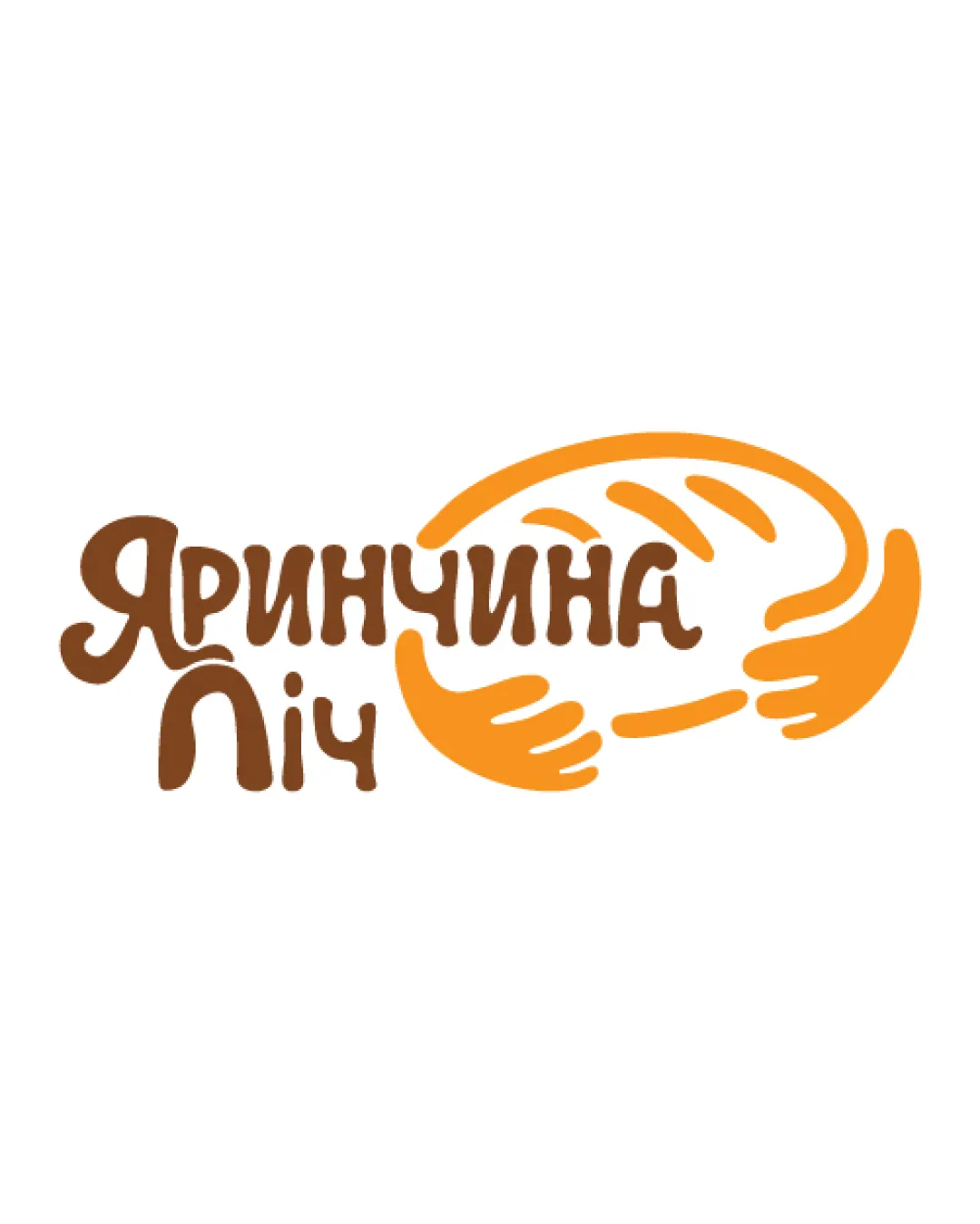
Try it Now!Logo review of El Dulce Masa
 Logo analysis by AI
Recognized style:
Logo type:
Detected symbol:
Detected text:
Business industry:
Review requested by Helene
**If AI can recognize or misinterpret it, so can people.
Structured logo review
Legibility
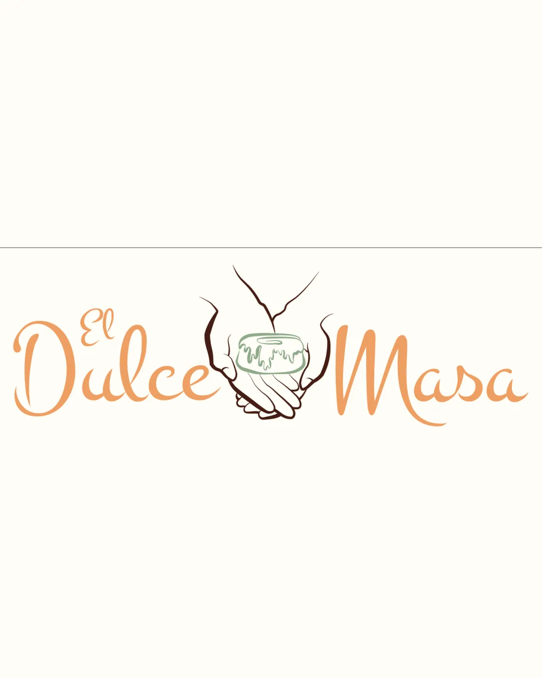
![]() I assume the business name is El Dulce Masa, which is legible.
I assume the business name is El Dulce Masa, which is legible.
![]() The script font could be slightly challenging for quick reading.
The script font could be slightly challenging for quick reading.
Scalability versatility
![]() The design is simple enough to be versatile across various media.
The design is simple enough to be versatile across various media.
![]() The intricate details may lose clarity at smaller sizes.
The intricate details may lose clarity at smaller sizes.
200x250 px
100×125 px
50×62 px
Balance alignment
![]() The text and image are well-balanced within the design.
The text and image are well-balanced within the design.
![]() The imagery may slightly overpower the text due to its central positioning.
The imagery may slightly overpower the text due to its central positioning.

Originality
![]() The use of hands adds a personal touch to an otherwise common dessert theme.
The use of hands adds a personal touch to an otherwise common dessert theme.
![]() Hands holding items are a relatively common symbol.
Hands holding items are a relatively common symbol.
Aesthetic look
![]() The logo has an inviting and professional aesthetic.
The logo has an inviting and professional aesthetic.
![]() The design elements may feel a bit spaced out, affecting cohesiveness.
The design elements may feel a bit spaced out, affecting cohesiveness.
Cultural sensitivity dual meaning
![]() No cultural sensitivity issues detected.
No cultural sensitivity issues detected.
Color harmony
![]() The pastel colors are harmonious and fitting for the dessert theme.
The pastel colors are harmonious and fitting for the dessert theme.