What to preserve
The logo uses a stylized fish with tribal or cultural motifs and a clean geometric wordmark to create a distinct identity relevant to Peruvian gastronomy.
Spelling & grammar
No obvious issue foundAll text clear and accurate.
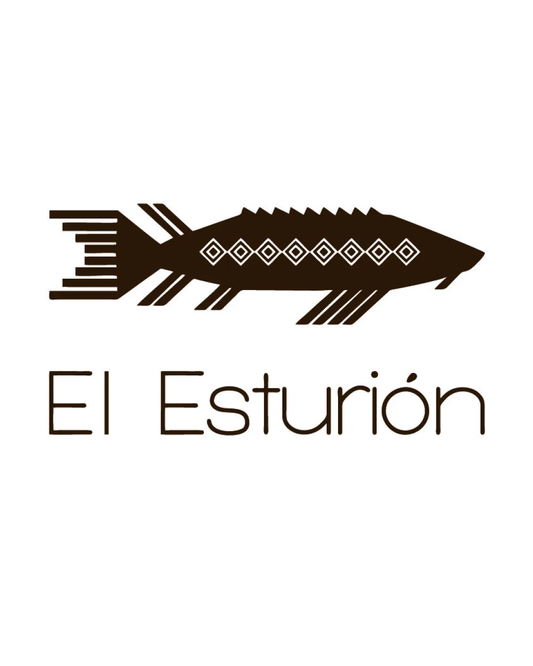
This logo is distinctive, relevant, and well executed, though small-size usage should be tested to ensure clarity.
Focus on the changes that matter. Keep what makes the logo work.
The logo uses a stylized fish with tribal or cultural motifs and a clean geometric wordmark to create a distinct identity relevant to Peruvian gastronomy.
All text clear and accurate.
Logo preview unavailable. The written feedback is still available on this card.
fish illustration (top band)
Fine lines in the tail and body of the fish may become indistinct at small sizes.
See the category reviewwordmark and fish lockup (full logo)
Wordmark and fish mark are currently well spaced but may benefit from slightly increased integration or visual connection for greater cohesion.
See the category reviewThe design integrates Peruvian motifs and gourmet cues via a refined fish illustration and modern wordmark, fitting the brief well.
Wordmark and fish mark are currently well spaced but may benefit from slightly increased integration or visual connection for greater cohesion.
Try: Explore slight adjustments to the positioning or visual tie between the mark and wordmark for a more unified look.

Inspect spacing with the guide. Optical balance may differ from geometric centering.
Fine lines in the tail and body of the fish may become indistinct at small sizes.
Try: Test logo legibility at reduced sizes and simplify details if they break up or blur.
Logo preview unavailable. The written feedback is still available on this card.
Get a clear logo score, key risks, and priority fix ideas before your client or audience sees it.
More credits needed
Add credits to continue without losing your work.
Then $7/month. Cancel anytime.
Essential logo review with AI
Estimated progress