View review
El Flaco
Review the detailed scores below to see what is working and what should be refined first.
Objective AI feedback. Your creative decision.
Logo performance breakdown
Legibility
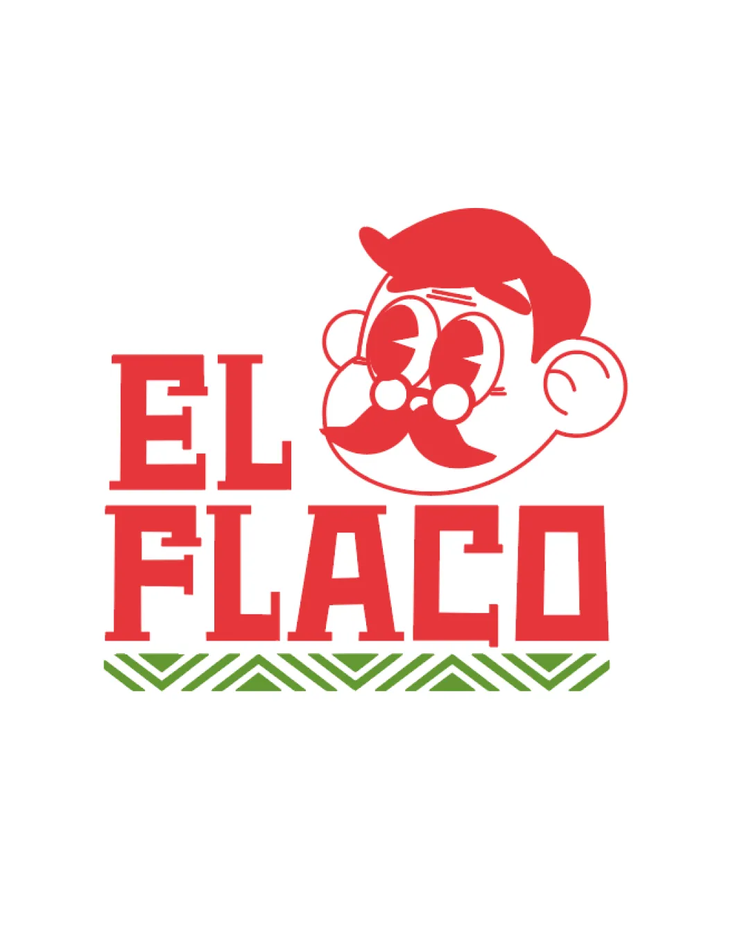
Bold, blocky serif font is easy to read.
High contrast between the red text/logo and white background.
The illustrative style of the character slightly crowds the text area, especially near the 'EL' portion, creating minor visual tension.
The details within the illustration may distract from the wordmark in smaller applications.

Originality
Custom illustration of the character adds unique personality and differentiates the brand.
Playful icon matches the brand's potential character.
Blocky serif font is fairly generic, not particularly customized.
Pattern below is common in restaurant branding and adds little originality.
Color harmony
Limited palette of red and green is bold but harmonious.
Colors work well for food/restaurant sector and are not overwhelming.
Red
#E03A3E
Green
#599035
White
#FFFFFF
Balance alignment
Text and illustration have roughly equal visual weight.
Alignment between the face illustration and the 'EL' word appears slightly off-balance, with the head floating right, creating asymmetry and visual tension.
Pattern below 'FLACO' risks making the lower part of the composition feel bottom-heavy.
Scalability
Text remains legible at smaller sizes due to thick lettering.
Flat color use helps maintain clarity when scaled.
Facial details and fine lines in the character illustration risk losing clarity at very small sizes, such as favicons or embroidery.
The complexity of the mark reduces adaptability for small product tags or digital app icons.
200x250 px
100×125 px
50×62 px
Misinterpretations
No clear risk of inappropriate or confusing alternate interpretations.
Symbol & text fit
Color and playful tone are consistent between illustration and wordmark.
Both elements are bold and visually engaging.
Stylistic playfulness in the character illustration doesn't fully harmonize with the rigid, geometric font.
The proportion of the head vs. text can cause slight disconnect.
Wondering how your logo performs?
Get a clear logo score, key risks, and priority fix ideas before your client or audience sees it.



