 View review
Logo score
Logo review of
Golfgest
A polished, distinctive, and highly appropriate combination mark with only minor improvements for scalability.
Objective AI feedback. Your creative decision.
Legibility
Originality
Misread
Balance
Scale
Action plan
What to fix first
The most important fixes to handle before polishing the full presentation.
1
Slightly bolden or simplify the smallest bar on the mark for better tiny-size clarity.
Medium prioritySmallest detail may blur in reproduction but is easy to strengthen.
Impact: Improves Micro-scalability For Digital And Print Use. · Effort: Low
Detailed review
Logo performance breakdown
Legibility
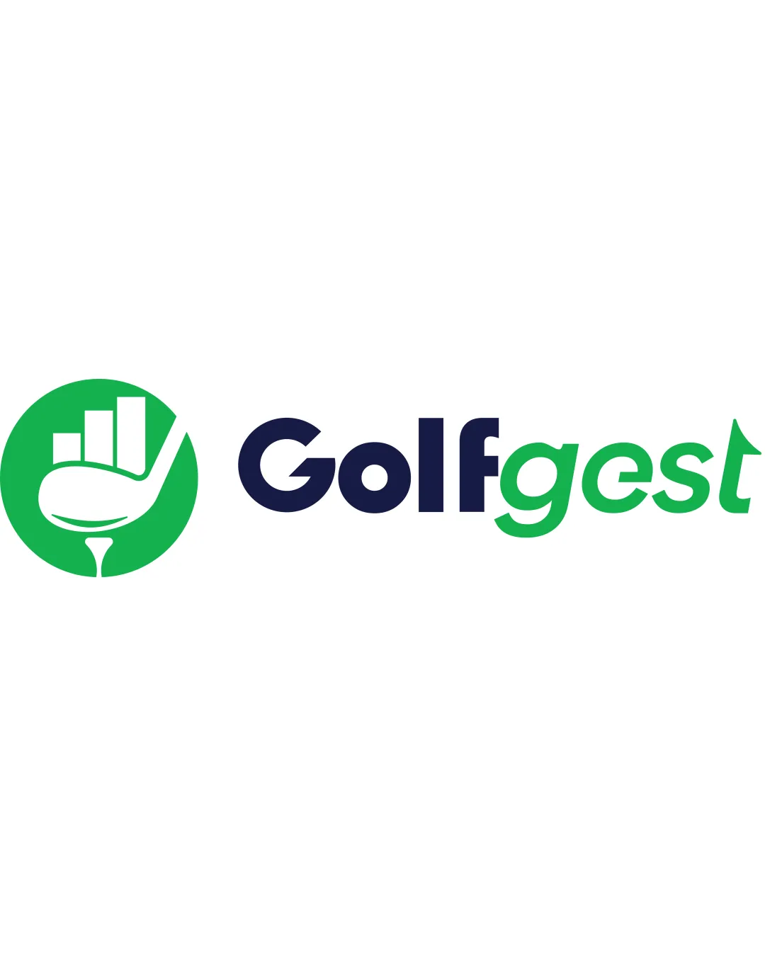
 All text clear and easy to read at a range of sizes. Distinct color separation between 'Golf' and 'gest' assists clarity.
Originality
Golf club with a bar chart is a relevant mashup for a data/analytics brand.
 Golf club and chart iconography is somewhat expected for this sector.
Color harmony
Green and navy create a fresh, professional palette with strong contrast.
Green
#23b14d
Navy
#181c37
Your palette is close. Refine the color roles and combinations before updating the logo.
Build brand colorsBalance alignment
Good spatial relationship between mark and wordmark. Even letter spacing; balanced left-to-right composition.

Scalability
Mark and text are simple and maintain clarity at small sizes.
Vertical bars in mark may lose some detail at very small sizes.
200x250 px
100×125 px
50×62 px
Misinterpretations
No risky shapes, ambiguity, or problematic negative space.
Logo structure & brief match
Bar chart mark relates directly to the business name and purpose.
Color and geometric link between mark and wordmark.
Industry Relevance: Logo suits a business combining golf and data/analytics through the chosen imagery.
Try your own review
Review my logo
Wondering how your logo performs?
Get a clear logo score, key risks, and priority fix ideas before your client or audience sees it.
Keep exploring