 View review
Logo score
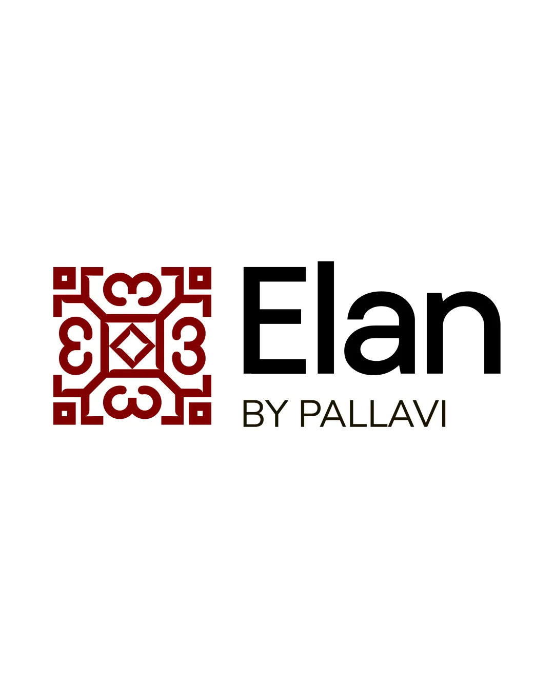
Logo review ofElan By Pallavi
Review the detailed scores below to see what is working and what should be refined first.
Legibility
Originality
Misread
Balance
Scale
Detailed review
Logo performance breakdown
Legibility
![]() Both 'Elan' and 'BY PALLAVI' are clear, readable, and have good contrast with the background
Both 'Elan' and 'BY PALLAVI' are clear, readable, and have good contrast with the background![]() Font choices are clean and not overdecorated
Font choices are clean and not overdecorated
Originality
![]() Ornamental monogram is distinctive and offers a unique geometric layout
Ornamental monogram is distinctive and offers a unique geometric layout![]() Diamond negative space adds a thoughtful touch
Diamond negative space adds a thoughtful touch
![]() The ornament style is reminiscent of traditional motifs and could appear generic if not tied clearly to the brand's story or region
The ornament style is reminiscent of traditional motifs and could appear generic if not tied clearly to the brand's story or region
Color harmony
![]() Restrained use of color: deep red with black and white offers high contrast and brand recognition
Restrained use of color: deep red with black and white offers high contrast and brand recognition![]() Colors are elegant and suggest premium positioning
Colors are elegant and suggest premium positioning
Deep Red
#900C10
Black
#181716
White
#FFFFFF
Balance alignment
![]() Overall good alignment between the logomark and the wordmark and clear visual separation
Overall good alignment between the logomark and the wordmark and clear visual separation![]() Logomark is proportionate in size to the wordmark
Logomark is proportionate in size to the wordmark
![]() There is some visual heaviness in the symbol compared to the relatively light thin subtext 'BY PALLAVI'
There is some visual heaviness in the symbol compared to the relatively light thin subtext 'BY PALLAVI'

Scalability
![]() Simple geometric shapes enable decent reproduction at medium-to-large sizes
Simple geometric shapes enable decent reproduction at medium-to-large sizes![]() Logomark is distinguishable for signage or packaging
Logomark is distinguishable for signage or packaging
![]() Intricate detailing in the ornamental symbol may blur or lose clarity at small sizes (e.g. favicon, embroidery)
Intricate detailing in the ornamental symbol may blur or lose clarity at small sizes (e.g. favicon, embroidery)![]() Thin lines within the logomark can break down at very small scale
Thin lines within the logomark can break down at very small scale
200x250 px
100×125 px
50×62 px
Misinterpretations
![]() No inappropriate or unintended symbols detected
No inappropriate or unintended symbols detected
Symbol & text fit
![]() Modern typeface complements the structured geometry of the logomark
Modern typeface complements the structured geometry of the logomark
![]() Good contrast in weight and style between the bold logomark and sleek wordmark
Good contrast in weight and style between the bold logomark and sleek wordmark
![]() The vintage motif of the symbol could clash slightly with the much more minimal wordmark, so extra tweaks in integration would help
The vintage motif of the symbol could clash slightly with the much more minimal wordmark, so extra tweaks in integration would help
Try your own review
Review my logo
Wondering how your logo performs?
Get a clear logo score, key risks, and priority fix ideas before your client or audience sees it.
Keep exploring


