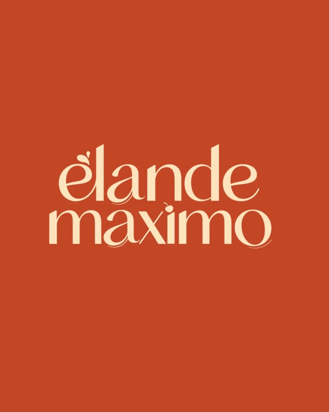
elande maximo logo review
4/5
Logo score
Logo review of

Elande Maximo

Distinctive, stylish wordmark with strong sector fit and minor tweaks needed for maximum versatility.

Wordmark Elegant Serif Wordmark With Playful Organic Accents Confectionery
4/5
Legibility
4/5
Originality
5/5
Misread
4/5
Balance
4/5
Scale
Action plan

What to fix first

The most important fixes to handle before polishing the full presentation.

1

Simplify or slightly enlarge the decorative accents for improved clarity in small-scale uses.

Medium priority

The ornamental details could blur or disappear at small sizes, which slightly impacts scalability.

Impact: Improves Legibility And Brand Versatility Across Applications. · Effort: Low

Detailed review

Logo performance breakdown

4/5

Legibility

Checkmark icon Clear, stylish serif typography is readable at most sizes.
Checkmark icon Subtle flourishes do not obscure letterforms.

Warning icon Some accents near 'e', 'x', and 'i' may be momentarily ambiguous at small scales.

4/5

Originality

Checkmark icon Distinctive letterform accents add memorability.
Checkmark icon Custom elements set it apart from generic wordmarks.

Warning icon Serif wordmarks are common, but this one has a unique execution.

4/5

Color harmony

Checkmark icon Warm, appetizing palette aligns with food/confectionery sector.
Checkmark icon Strong contrast for readability.

Warning icon Limited palette may constrain future flexibility.

Burnt Orange
#C1532C

Cream
#FBE3C3

Your palette is close. Refine the color roles and combinations before updating the logo.

Build brand colors
4/5

Balance alignment

Checkmark icon Well-aligned stacked wordmark.
Checkmark icon Good spacing and weight distribution between both lines.

Warning icon Slight unevenness where flourishes intersect or protrude.

logo 200x250 pixels scalability test alignment grid overlay
4/5

Scalability

Checkmark icon Typographic style holds up at a variety of sizes.
Checkmark icon Detail level is manageable for small applications.

Warning icon Small flourishes on some letters risk losing clarity under heavy reduction.

logo 200x250 pixels scalability test

200x250 px

logo 100x125 pixels scalability test

100×125 px

logo 50x62 pixels scalability test

50×62 px

5/5

Misinterpretations

Checkmark icon No unintended silhouettes or negative space issues.

Brief match

Checkmark icon Industry: Elegant organic wordmark aligns well with a confectionery or bakery brand, conveying artisanal quality.

Try your own review

Wondering how your logo performs?

Get a clear logo score, key risks, and priority fix ideas before your client or audience sees it.

Review my logo