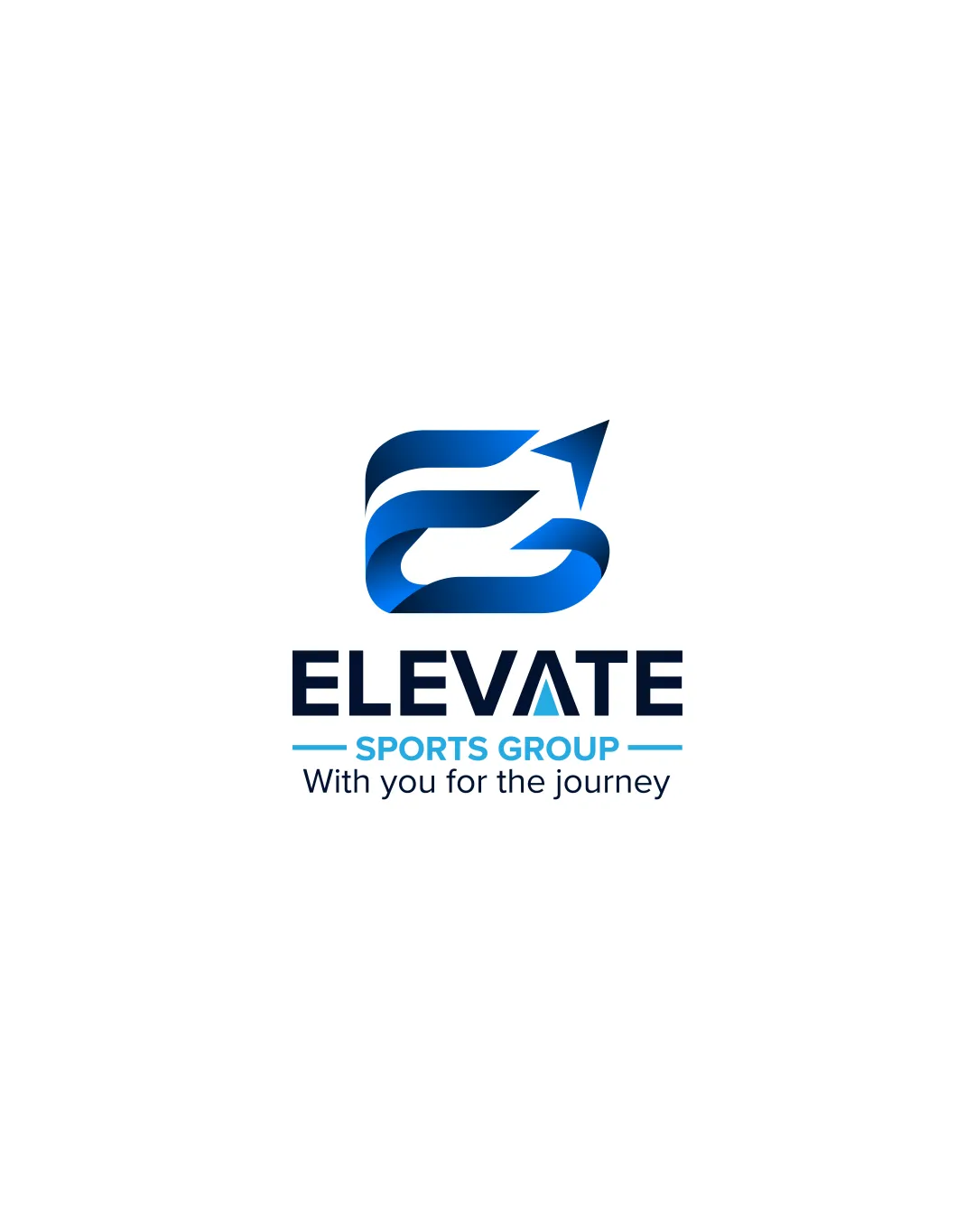
ELEVATE SPORTS GROUP With you for the journey logo review
4.2 / 5
Logo score
Logo review of

Elevate Sports Group With You For The Journey

A strong, well-executed logo with effective industry fit and visual professionalism. Limited uniqueness, but concept and execution are solid.

Objective AI feedback. Your creative decision.

Combination Mark Modern Gradient, Geometric Sports
4.5/5
Legibility
3.5/5
Originality
5/5
Misread
4.5/5
Balance
4/5
Scale
Action plan

What to fix first

The most important fixes to handle before polishing the full presentation.

1

Consider a version of the mark with simplified color (solid fill or single-color option) for small or one-color applications.

Medium priority

Gradient detail may not reproduce well at small sizes or in monochrome.

Impact: Improves Scalability And Practical Usage Across Different Mediums. · Effort: Low

Detailed review

Logo performance breakdown

4.5/5

Legibility

Checkmark icon Wordmark 'ELEVATE' is highly readable.
Checkmark icon Tagline and subtext are clear.

Warning icon Minor legibility concern with stylized 'A' containing a triangle, which may distract slightly.

3.5/5

Originality

Checkmark icon Arrow integrated thoughtfully into the monogram.

Warning icon Arrow/E combination is a familiar approach in sports branding; not fully unique.

4.5/5

Color harmony

Checkmark icon Blue shades feel energetic and modern; appropriate for sports.
Checkmark icon Palette is consistent and professional.

Blue
#0057A7

Light Blue
#00AEEF

Black
#000000

White
#FFFFFF

Your palette is close. Refine the color roles and combinations before updating the logo.

Build brand colors
4.5/5

Balance alignment

Checkmark icon Good alignment between mark and wordmark.
Checkmark icon Elements are visually balanced and centered.

logo 200x250 pixels scalability test alignment grid overlay
4/5

Scalability

Checkmark icon Simple shapes and contrast support readability at small sizes.
Checkmark icon Mark is compact and recognizable.

Warning icon Gradient and fine detail in the mark may lose subtlety when reduced.

logo 200x250 pixels scalability test

200x250 px

logo 100x125 pixels scalability test

100×125 px

logo 50x62 pixels scalability test

50×62 px

5/5

Misinterpretations

Checkmark icon Arrow appropriately reinforces 'elevation' theme.

4 / 5

Logo structure & brief match

Checkmark icon Mark and wordmark relate well through style and color palette.

Checkmark icon Industry Fit: The upward arrow and modern color palette suit a sports or athletic group, supporting ideas of progress and achievement.

Try your own review

Wondering how your logo performs?

Get a clear logo score, key risks, and priority fix ideas before your client or audience sees it.

Review my logo




