View review
Logo score
Logo review of
Elsan Clay Works Pty (ltd)
Review the detailed scores below to see what is working and what should be refined first.
Objective AI feedback. Your creative decision.
Legibility
Originality
Balance
Scale
Detailed review
Logo performance breakdown
Legibility
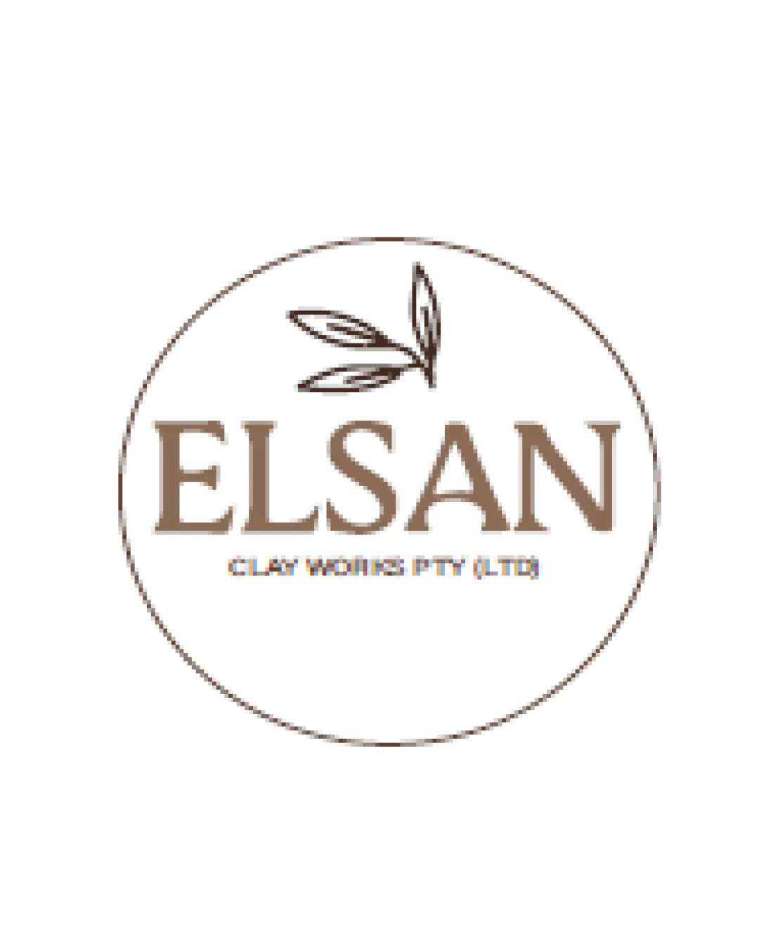
 Business name 'ELSAN' and tagline 'CLAY WORKS PTY (LTD)' are legible.
Originality
Leaves add a natural touch.
 Leaves are a common symbol in logos.
Color harmony
Earthy color palette suits the brand well.
Limited contrast may reduce visibility on certain backgrounds.
Your palette is close. Refine the color roles and combinations before updating the logo.
Build brand colorsBalance alignment
Well-balanced design with central alignment.

Scalability
Simple design is versatile for different applications.
Thin lines on leaves might become less visible when scaled down.
200x250 px
100×125 px
50×62 px
Symbol & text fit
Text and symbol are cohesive within the circle.
Try your own review
Review my logo
Wondering how your logo performs?
Get a clear logo score, key risks, and priority fix ideas before your client or audience sees it.
Keep exploring