Wondering how your logo performs? 🧐
Get professional logo reviews in seconds and catch design issues in time.
Try it Now!Logo review of EMERALD CANOPY ROOFTOP
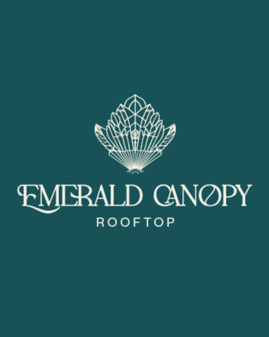
 Logo analysis by AI
Logo type:
Style:
Detected symbol:
Negative space:
Detected text:
Business industry:
Review requested by A_nuishka
**If AI can recognize or misinterpret it, so can people.
Structured logo review
Legibility
 The word 'ROOFTOP' is highly legible due to a sans-serif font and clear spacing. 'EMERALD' is fairly readable as the majority of letters are classical and distinct.
 The decorative serif in 'EMERALD' and 'CANOPY', especially the stylized 'O' and flourished 'E', hinders instant readability. The spacing between some letters feels slightly tight, and the decorative elements may cause confusion at smaller scales.
Scalability versatility
Works well for large applications like signage, menus, and digital headers. Detailed logomark could be effective on upscale product packaging or print media.
Finely detailed lines in the canopy symbol will lose clarity at small sizes, such as on favicons, mobile app icons, or embroidery. The thin linework is susceptible to breaking down on business cards or small promotional materials.
200x250 px
100×125 px
50×62 px
Balance alignment
The vertical arrangement (symbol above, text below) offers a clear visual hierarchy. Central alignment of all elements works well for upscale branding.
The weight of the ornate logomark compared to the elegant but lighter-weight wordmark creates a subtle imbalance. The flourished 'E' in EMERALD pulls visual weight leftward, conflicting with the centered alignment.

Originality
Distinctive art deco canopy motif is not generic and displays originality. Stylized 'O' in 'CANOPY' with a diagonal line adds a bespoke touch. Combination of flourished script and geometric mark is unique.
Leaf/canopy/plant motifs are somewhat common in hospitality and 'roof garden' concepts, though this execution is less typical.
Logomark wordmark fit
Both logomark and wordmark share an elegant, upscale personality. Art deco styling creates visual cohesion between symbol and type.
The logomark's complexity slightly overpowers the thinner text. A bolder wordmark may create better visual balance for versatility.
Aesthetic look
The logo embodies sophistication and class appropriate for a high-end venue. The restrained color palette elevates the overall design.
Extensive fine detail in the logomark risks appearing busy, especially at smaller scales. The serif/font choice, while elegant, introduces some visual noise due to flourishes.
Dual meaning and misinterpretations
No unintended meanings or inappropriate visuals detected, supporting clear brand communication.
Color harmony
Deep teal and ivory create a refined, calming, and harmonious balance. Color contrast ensures sufficient prominence and readability.
Deep Teal
#105B5E
Ivory
#F5F4ED