EMEX G and crown logo logo review
3.2/5
Logo score Combination mark category

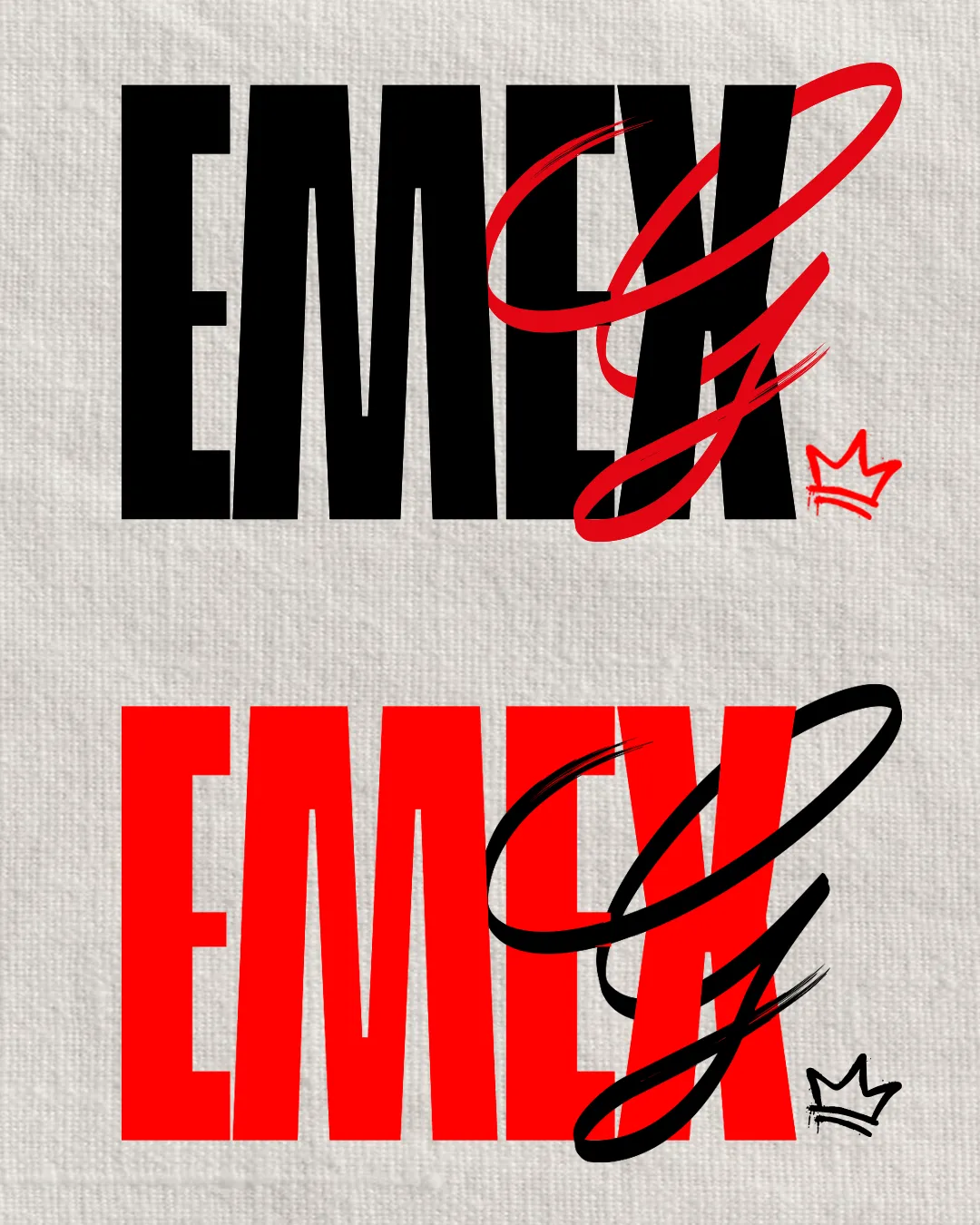
EMEX G and crown logo

creative344936 Essential logo review

The logo offers strong personality and memorability but suffers from visual congestion and clarity issues due to overlapping styles; adjusting the script element would enhance readiness for brand deployment.

This logo set has a workable foundation; improving visual balance is the clearest next step.

Combination Mark Bold/contrast Lettering With Handwritten And Accent Symbol Apparel/fashion/streetwear
2.6/5
Legibility
4/5
Originality
3/5
Balance
3/5
Scale
4/5
Color
3/5
Style consistency
Your next steps

What to fix first

Focus on the changes that matter. Keep what makes the logo work.

1

script 'G' overlapping 'EMEX'

Adjust the script 'G' size or placement to reduce visual overlap and improve clarity of both elements.

High priority Visible issue Medium effort

The large script 'G' overlaps heavily with the bold block 'EMEX,' causing visual congestion and some loss of clarity, which could hinder quick readability and brand recall, especially at smaller sizes or on busy backgrounds.

How to check

Test the lockup for legibility at reduced sizes and on varied backgrounds.

See the category review
Detailed review

Logo performance breakdown

4/5

Brief & logo match

This logo's energetic combination of bold and handwritten styles fits an apparel or streetwear context, though the overlapping elements compromise clarity and versatility.

5/5

Misinterpretations

This review includes a score but no supporting explanation for this category.

4/5

Originality

Symbol 4/5 · Wordmark 4/5

  • Distinct fusion of bold and handwritten styles with a crown sketch creates a memorable, unique signature.
4/5

Color harmony

Symbol 4/5 · Wordmark 4/5

  • Contrasting black/red color choices reinforce energy and highlight key elements.
Black#000000
Red#FF0000

Estimated colors. Use the original design file for exact values.

Create a full color palette using these colors

Create new palette
3/5

Balance alignment

Symbol 3/5 · Wordmark 3/5 · Layout 3/5

  • Although visually impactful, the two high-contrast styles (block and script) can feel slightly discordant and lead to a lack of unified flow in the logo, especially when combined with an external symbol (crown).

    Optional refinement overall composition
Uploaded logoAlignment guide overlay

Inspect spacing with the guide. Optical balance may differ from geometric centering.

3/5

Scalability

Symbol 3/5 · Wordmark 3/5 · Layout 3/5

Available in Advanced logo reviews
3/5

Style consistency

Available in Advanced logo reviews
2.6/5

Legibility

Wordmark 3/5 · Layout 2/5

This review includes a score but no supporting explanation for this category.

Try your own review

Wondering how your logo performs?

Get a clear logo score, key risks, and priority fix ideas before your client or audience sees it.

Review my logo