SY hexagon pavement logo logo review
4/5
Logo score Symbol category

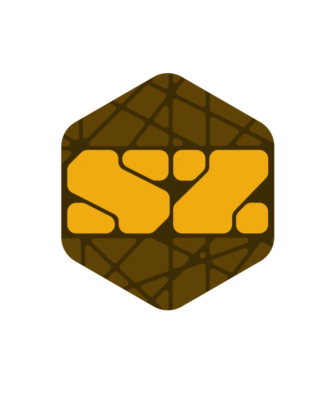
SY hexagon pavement logo

creative147300 Essential logo review

Distinctive, industry-appropriate symbol with strong association to groundwork and paving, though abstracted lettering may challenge clarity without supporting text.

This logomark shows strong execution, supported by distinctive construction and clarity at smaller sizes.

Symbol Geometric, Abstract, Bold, Flat Construction/gardening/landscaping
4/5
Originality
4/5
Balance
4/5
Scale
4/5
Color
Your next steps

What to fix first

Focus on the changes that matter. Keep what makes the logo work.

1

central symbol (yellow geometric blocks)

Test legibility at reduced sizes and among users unfamiliar with the brand.

High priority Worth testing Low effort

The abstract forms seem to reference 'SY' but do not read as clear letters at first glance, especially at smaller sizes or to new viewers.

See the category review
Detailed review

Logo performance breakdown

4/5

Brief & logo match

The abstract hexagon and paving motif reflect ground and pavement works very well, though letter clarity is compromised in favor of industry symbolism.

5/5

Misinterpretations

  • No unintended associations or ambiguous shapes detected.
4/5

Originality

  • Pattern detail provides industry fit and visual interest beyond a generic badge.
  • The pattern work links to paving and groundworks in a bold, ownable way, but the use of a hexagonal boundary is common in construction/environmental logos.

    Optional refinement overall symbol
4/5

Color harmony

  • Natural earth tones reinforce the industry and complement each other well.
Yellow-Orange#FFBE1A
Dark Brown#584618

Estimated colors. Use the original design file for exact values.

Create a full color palette using these colors

Create new palette
4/5

Balance alignment

Available in Advanced logo reviews
4/5

Scalability

Available in Advanced logo reviews

Legibility

  • The abstract forms seem to reference 'SY' but do not read as clear letters at first glance, especially at smaller sizes or to new viewers.

    Worth testing central symbol (yellow geometric blocks)

    Try: Test legibility at reduced sizes and among users unfamiliar with the brand.

Try your own review

Wondering how your logo performs?

Get a clear logo score, key risks, and priority fix ideas before your client or audience sees it.

Review my logo