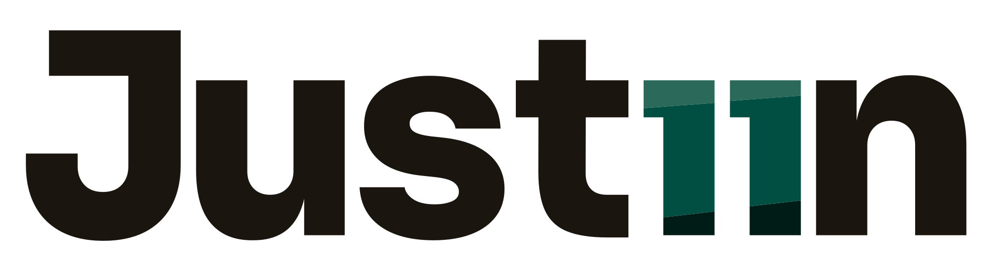
Just11n logo logo review
3.6/5
Logo score Wordmark category

Just11n logo

creative241139 Essential logo review

A distinctive and bold wordmark with clever typographic play, but verify legibility for all audiences due to the numeral substitution.

This wordmark shows solid execution, supported by distinctive construction and clarity at smaller sizes; improving text readability is the clearest next step.

Wordmark Bold Geometric Sans-serif, Stylized Digit Substitution
3/5
Legibility
4/5
Originality
3/5
Balance
4/5
Scale
4/5
Color
Your next steps

What to fix first

Focus on the changes that matter. Keep what makes the logo work.

1

within bounds, substitute '11' for 'i'

Test the logo in context to confirm that viewers reliably read it as 'Justin', not 'Just eleven n'.

High priority Worth testing Low effort

The use of two colored vertical bars ('11') as the letter 'i' is legible but may be momentarily confusing and could be misread as numerals.

See the category review
Detailed review

Logo performance breakdown

Not scored

Brief & logo match

There isn't enough brand context to assess the match.

4/5

Originality

  • Creative use of numeric substitution for a letter.
4/5

Color harmony

  • Contrast between black and teal draws attention to the visual play while maintaining harmony.
Black#181715
Teal Green#116862

Estimated colors. Use the original design file for exact values.

Create a full color palette using these colors

Create new palette
4/5

Scalability

  • Simple, bold letterforms likely to hold up at small sizes.
3/5

Legibility

Available in Advanced logo reviews
3/5

Balance alignment

Available in Advanced logo reviews
3/5

Misinterpretations

This review includes a score but no supporting explanation for this category.

Black & white

Does the shape still work without color?

Preparing artwork...

Background contrast

Find the surfaces where your logo stays clear.

Compare the mark and lettering on each surface.

Blur & silhouette

A 3px blur softens fine details so you can check whether the overall shape stays recognizable. If key gaps close or elements merge, the logo may rely too heavily on detail.

Original
3px blur

Look for clear separation between shapes and a distinctive outline.

Try your own review

Wondering how your logo performs?

Get a clear logo score, key risks, and priority fix ideas before your client or audience sees it.

Review my logo