EngagePro Media logo review
4.6 / 5
Logo score
Logo review of

Engagepro Media

Review the detailed scores below to see what is working and what should be refined first.

Objective AI feedback. Your creative decision.

Combination Mark Modern, Geometric Media
5/5
Legibility
4/5
Originality
5/5
Misread
4/5
Balance
4/5
Scale
Detailed review

Logo performance breakdown

5/5

Legibility

Checkmark icon Text is highly legible due to simple, bold sans-serif typeface.
Checkmark icon High color contrast between text and background enhances readability.
4/5

Originality

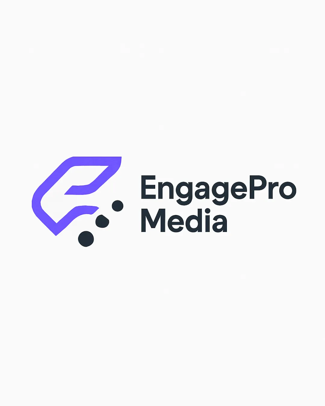
Checkmark icon Abstract E monogram is distinctive, creating a modern and recognizable symbol.
Checkmark icon Dot motif adds unique character related to engagement, movement, or media interactivity.

Warning icon The combination of an abstract letter with dots is somewhat familiar in tech/media, reducing full originality.

5/5

Color harmony

Checkmark icon Limited palette of indigo and charcoal—professional and sophisticated.
Checkmark icon White background amplifies contrast without overwhelming.

Lavender Indigo
#8265FF

Gunmetal
#23272C

White
#FFFFFF

4/5

Balance alignment

Checkmark icon Good spatial relationship between symbol and wordmark achieves visual balance.
Checkmark icon Consistent vertical and horizontal alignment.

Warning icon The distributed spacing of the dots causes slight imbalance relative to the compactness of the logotype.

logo 200x250 pixels scalability test alignment grid overlay
4/5

Scalability

Checkmark icon Simple geometric shape ensures the logo scales well across different sizes.
Checkmark icon The bold lines and solid text maintain clarity on billboards, screen applications, and print.

Warning icon Three small dots may lose definition at very small sizes like favicons or embroidery.
Warning icon The icon’s complexity (dots with spatial gaps) could pose challenges in tight or limited space applications.

logo 200x250 pixels scalability test

200x250 px

logo 100x125 pixels scalability test

100×125 px

logo 50x62 pixels scalability test

50×62 px

5/5

Misinterpretations

Checkmark icon No inappropriate or confusing imagery detected in the logomark.
Checkmark icon Abstract elements clearly communicate motion/engagement.

5 / 5

Symbol & text fit

Checkmark icon Visual weight and style of the logomark pair successfully with the bold, geometric wordmark.
Checkmark icon Consistent angular motifs create brand cohesion.

Try your own review

Wondering how your logo performs?

Get a clear logo score, key risks, and priority fix ideas before your client or audience sees it.

Review my logo