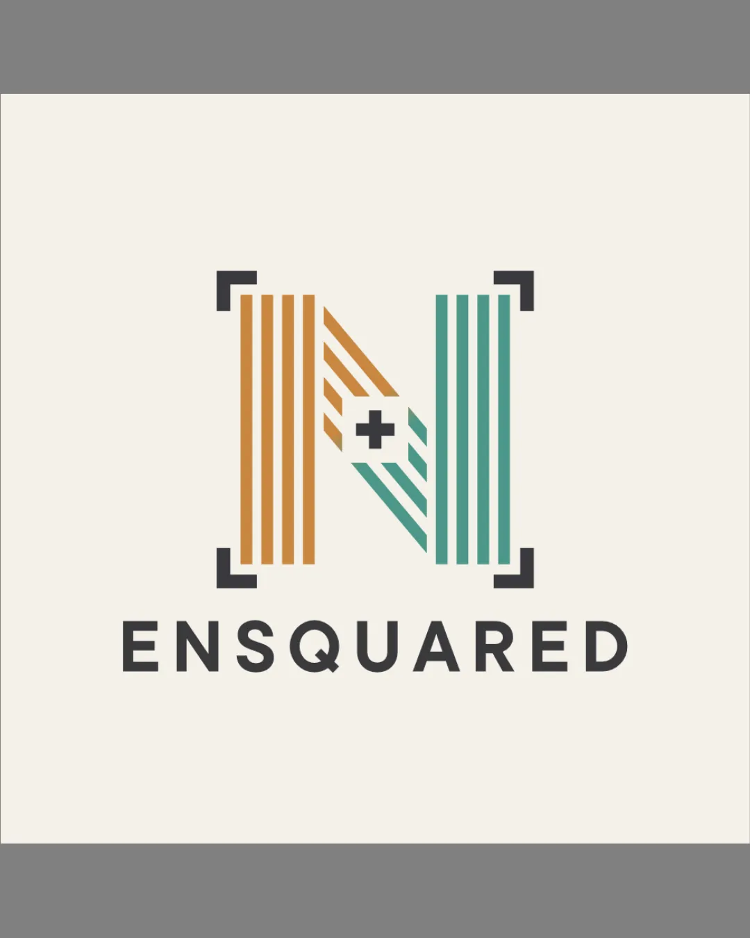
ENSQUARED logo review
4/5
Logo score
Logo review of

Ensquared

A strong, concept-driven logo with high relevance to the brand; minor refinements and size testing recommended for maximum versatility.

Combination Mark Modern Geometric, Minimal Tech Creative Digital/events/music
5/5
Legibility
4/5
Originality
5/5
Misread
4/5
Balance
3/5
Scale
Your next steps

What to fix first

Focus on the changes that matter. Keep what makes the logo work.

1

striped N logomark

Test the mark at small/mobile avatar sizes to ensure all elements remain distinct and readable.

Worth testing High priority Low effort
Area to inspectApproximate location

Vertical stripes and the small plus sign could lose clarity or merge at very small sizes.

How to check

Review logo at 32px, 24px, and favicon scale for stripe/plus clarity.

See the category review
2

logomark and wordmark stack

Reduce wordmark tracking slightly for a tighter fit under the logomark.

Optional refinement Medium priority Low effort

The alignment between the width of the logomark and the wordmark is close, but slightly tightening the wordmark's letter spacing could improve visual cohesion as a unit.

How to check

Test different tracking values for improved proportional balance in the lockup.

See the category review
Detailed review

Logo performance breakdown

5/5

Brief & logo match

Based on your brief
Compared with

Events, video production, and a digital platform for musicians — South African creative company connecting artists across digital and live media.

Logo directly visualizes the N/Ensquared concept and conveys creative collaboration, fitting the music/events/production context.

  • Reference To 'Ensquared' Name And N² Concept

    The geometric square corners and N shape directly reflect the brand's 'Ensquared' name and the N² wordplay.

  • Creative/events/video/music Industry Symbolism

    Split colors and dynamic lines evoke diversity, collaboration, and energy—core to a creative/entertainment brand.

5/5

Legibility

  • Wordmark is highly readable and clear.
  • Distinctive geometric 'N' is easily recognized at normal size.
4/5

Originality

  • N-stripe concept with + and squared corners is visually unique.
  • Color split gives distinctive character.
5/5

Color harmony

  • Orange and teal contrast vibrantly and attractively.
  • Anchor black for structure, cream for warmth.
Orange#B87130
Teal#399C8F
Black#222222
Cream#EDE7DC

Estimated colors. Use the original design file for exact values.

Create a full color palette using these colors

Create new palette
4/5

Balance alignment

  • Mark and wordmark are centered and visually unified.
  • The alignment between the width of the logomark and the wordmark is close, but slightly tightening the wordmark's letter spacing could improve visual cohesion as a unit.

    Optional refinement logomark and wordmark stack

    Try: Reduce wordmark tracking slightly for a tighter fit under the logomark.

    Check: Test different tracking values for improved proportional balance in the lockup.

Uploaded logoAlignment guide overlay

Inspect spacing with the guide. Optical balance may differ from geometric centering.

3/5

Scalability

  • Strong block silhouette scales well overall.
  • Vertical stripes and the small plus sign could lose clarity or merge at very small sizes.

    Worth testing striped N logomark

    Try: Test the mark at small/mobile avatar sizes to ensure all elements remain distinct and readable.

    Check: Review logo at 32px, 24px, and favicon scale for stripe/plus clarity.
    Area to inspectApproximate location
Uploaded logo at 200 pixels wide
200 × 250 px
Uploaded logo at 100 pixels wide
100 × 125 px
Uploaded logo at 50 pixels wide
50 × 63 px

Compare the detail at different sizes. Labels show the full image dimensions.

5/5

Misinterpretations

  • No plausible negative or unintended readings.
4/5

Symbol & text fit

  • Wordmark pairs cohesively with the graphic N.
  • Both elements share a geometric, modern style.

Black & white

Does the shape still work without color?

These tests are available only for logos uploaded in vector (SVG) format.

Background contrast

Find the surfaces where your logo stays clear.

These tests are available only for logos uploaded in vector (SVG) format.

Blur & silhouette

A 3px blur softens fine details so you can check whether the overall shape stays recognizable. If key gaps close or elements merge, the logo may rely too heavily on detail.

These tests are available only for logos uploaded in vector (SVG) format.

Try your own review

Wondering how your logo performs?

Get a clear logo score, key risks, and priority fix ideas before your client or audience sees it.

Review my logo