View review
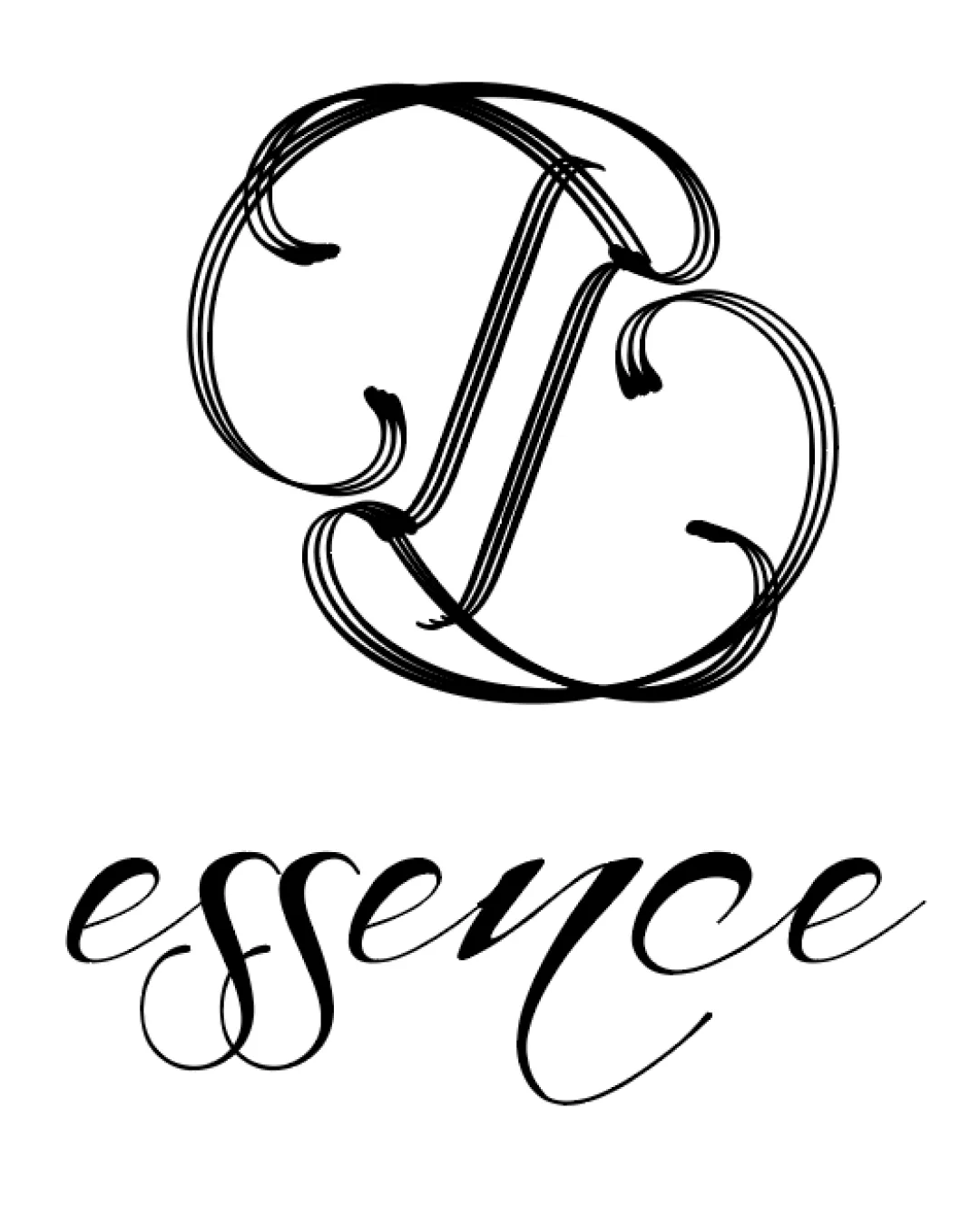
Logo review ofEssence
Review the detailed scores below to see what is working and what should be refined first.
Logo performance breakdown
Legibility
The word 'essence' is mostly clear in its flowing calligraphy.
Typeface communicates an elegant feel appropriate for beauty or luxury sectors.
The large ornate monogram is difficult to decipher at a glance—letters are heavily stylized and overlap, causing confusion.
Letterforms in the monogram lack immediate clarity which diminishes instant recognition.
The script in 'essence,' particularly the double 's' and final 'e,' may pose readability issues at smaller sizes.

Originality
Ornate, custom letterforms show effort toward uniqueness.
Calligraphic execution is less common among trendy minimal logos.
Monogram approach is fairly conventional in luxury and beauty markets.
Nothing distinctly memorable or differentiated among competitors using script monograms.
Color harmony
Single color scheme ensures high contrast and strong legibility on white backgrounds.
Black offers versatility and timelessness.
Black
#000000
White
#FFFFFF
Balance alignment
Visual weight of the monogram and wordmark is loosely balanced on a vertical axis.
Typographic flow matches general logo mood.
No strong alignment or anchoring between monogram and wordmark; appears as two disconnected elements.
Empty negative space between symbol and text accentuates separation rather than unity.
Scalability
Large format retains the calligraphic detail well, suitable for print collateral or high-end packaging.
Excessively thin and ornate line work will lose detail and become illegible at small sizes—problematic for business cards, favicons, or embroidery.
Monogram complexity does not scale well to digital usage or simplified mockups.
200x250 px
100×125 px
50×62 px
Misinterpretations
No problematic or inappropriate symbols detected.
Symbol & text fit
Both monogram and script wordmark share a calligraphic DNA and elegant style.
The stylistic difference in flourishes and line weight creates a mismatch—the monogram is more ornate and dense, whereas the wordmark is looser and more contemporary.
Visual connection between the two elements is weak.
Wondering how your logo performs?
Get a clear logo score, key risks, and priority fix ideas before your client or audience sees it.



