What to preserve
The logo combines an elegant monogram (GAS) with a symbolic bag and wings, paired with a contemporary wordmark and script tagline for upscale positioning.
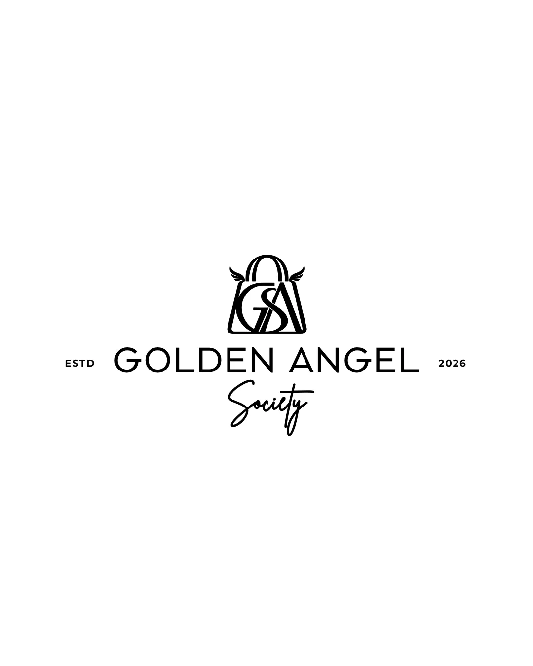
A distinctive, upscale logo with strong symbolism and minor hierarchy refinements needed for consistency.
Focus on the changes that matter. Keep what makes the logo work.
The logo combines an elegant monogram (GAS) with a symbolic bag and wings, paired with a contemporary wordmark and script tagline for upscale positioning.
Logo preview unavailable. The written feedback is still available on this card.
monogram (GAS) inside bag outline
The monogram's overlapping lines may reduce clarity at small sizes or quick glances.
See the category reviewLogo preview unavailable. The written feedback is still available on this card.
tagline 'Society' under main wordmark
Script tagline feels visually lighter and less anchored compared to geometric wordmark above, making hierarchy appear less cohesive.
See the category reviewThe logo visually supports a luxury or exclusive positioning through its elegant mark and wordmark integration.
The monogram's overlapping lines may reduce clarity at small sizes or quick glances.
Try: Test logo clarity at reduced sizes and on busy backgrounds.
Logo preview unavailable. The written feedback is still available on this card.
Script tagline feels visually lighter and less anchored compared to geometric wordmark above, making hierarchy appear less cohesive.
Try: Adjust tagline weight/letter spacing or position to strengthen visual anchoring.
Logo preview unavailable. The written feedback is still available on this card.

Inspect spacing with the guide. Optical balance may differ from geometric centering.
Get a clear logo score, key risks, and priority fix ideas before your client or audience sees it.
More credits needed
Add credits to continue without losing your work.
Then $7/month. Cancel anytime.
Essential logo review with AI
Estimated progress