Wondering how your logo performs? 🧐
Get professional logo reviews in seconds and catch design issues in time.
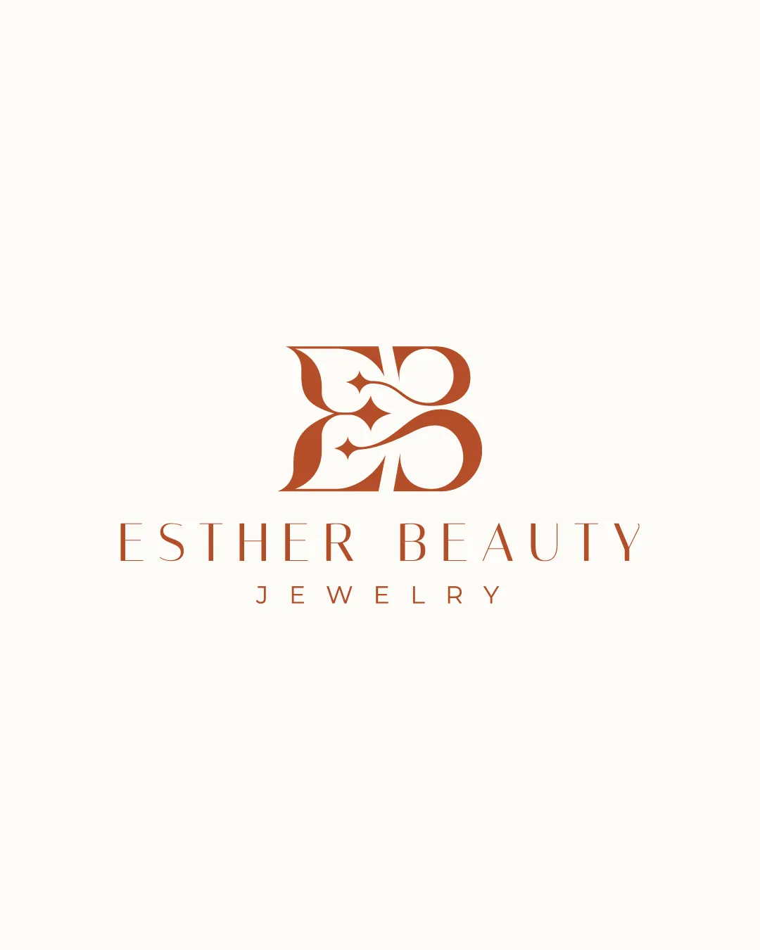
Try it Now!Logo review of ESTHER BEAUTY JEWELRY
 Logo analysis by AI
Logo type:
Style:
Detected symbol:
Detected text:
Business industry:
Review requested by Graphstorm
**If AI can recognize or misinterpret it, so can people.
Structured logo review
Legibility
![]() The text is clear and easily readable.
The text is clear and easily readable.![]() The choice of fonts complements the elegant style.
The choice of fonts complements the elegant style.
![]() The thinness of the font might affect readability in very small sizes.
The thinness of the font might affect readability in very small sizes.
Scalability versatility
![]() The monogram is simple enough to be scaled for different uses.
The monogram is simple enough to be scaled for different uses.![]() Works well in smaller applications due to simplicity.
Works well in smaller applications due to simplicity.
![]() Thin lines may lose visibility in extremely small applications like favicons.
Thin lines may lose visibility in extremely small applications like favicons.
200x250 px
100×125 px
50×62 px
Balance alignment
![]() Well-balanced and symmetrical design.
Well-balanced and symmetrical design.![]() The text is aligned properly beneath the monogram.
The text is aligned properly beneath the monogram.

Originality
![]() The intertwined letter design is unique.
The intertwined letter design is unique.![]() The elegant style stands out in the jewelry industry.
The elegant style stands out in the jewelry industry.
Logomark wordmark fit
![]() The style of the monogram matches the elegance of the wordmark perfectly.
The style of the monogram matches the elegance of the wordmark perfectly.![]() Proportions are well-maintained between the monogram and text.
Proportions are well-maintained between the monogram and text.
Aesthetic look
![]() The design is aesthetically pleasing with an elegant look.
The design is aesthetically pleasing with an elegant look.![]() The color choice adds to the overall sophistication.
The color choice adds to the overall sophistication.
Possible misinterpretations
![]() Clear representation with no apparent misinterpretations.
Clear representation with no apparent misinterpretations.
Color harmony
![]() The color is rich without being overwhelming.
The color is rich without being overwhelming.![]() Single color usage facilitates easy adaptation.
Single color usage facilitates easy adaptation.


