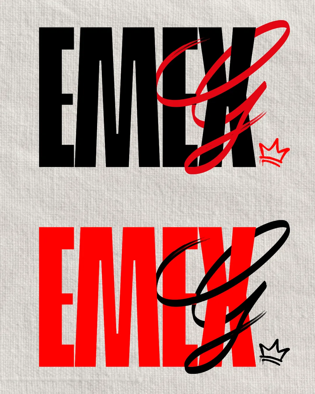
monogram and wordmark
Adjust either the mark or the wordmark to increase stylistic cohesion and harmony.
Logo preview unavailable. The written feedback is still available on this card.
The 'E' and 'C' monogram is blocky and geometric, while the wordmark is set in a rounded, softer sans serif, causing a minor mismatch in visual tone.
How to check
See the category review Ensure letter thickness and curves are more consistent between mark and wordmark.