EUROB logo logo review
4.1/5
Logo score Wordmark category

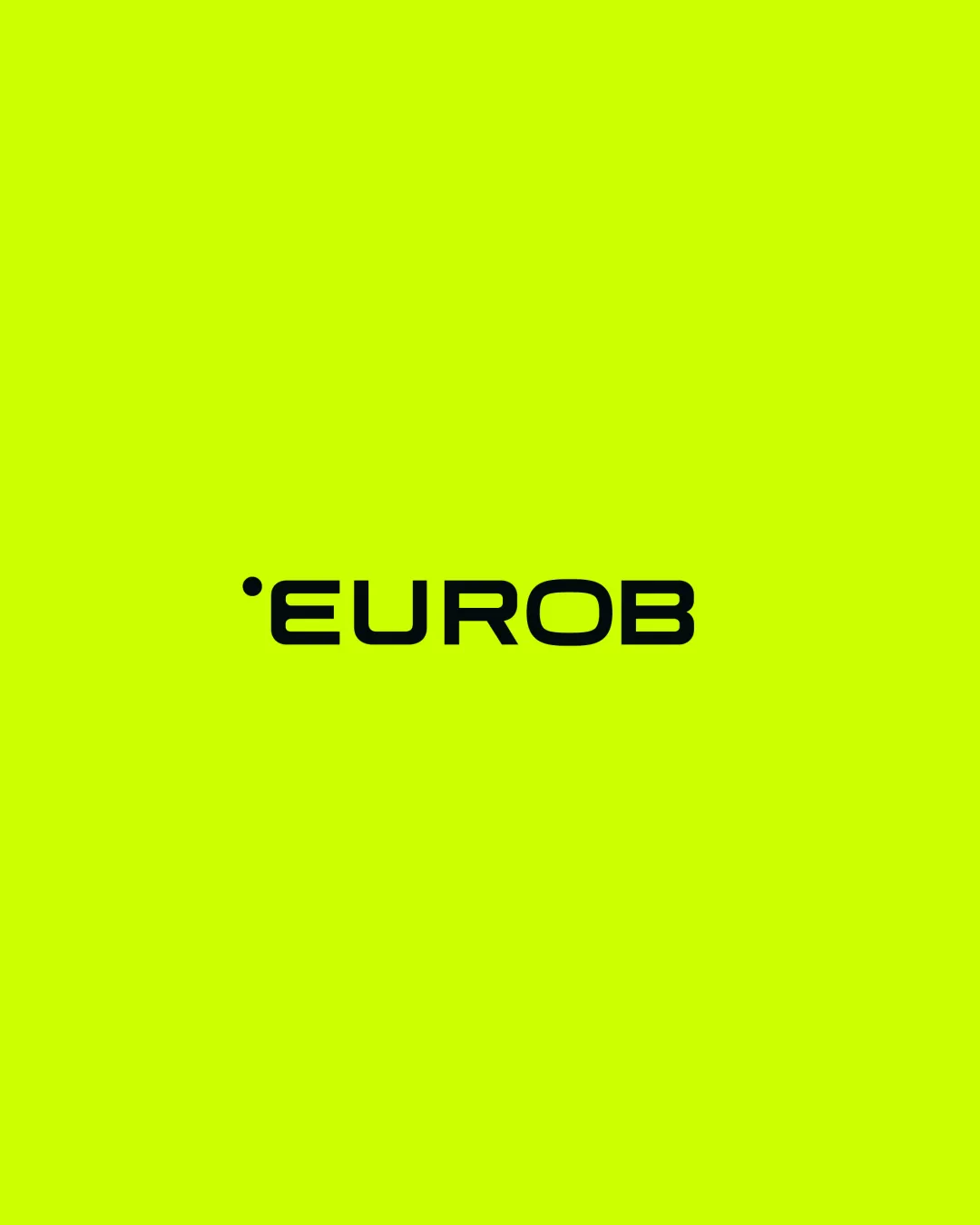
EUROB logo

creative991089 Essential logo review

A functional, modern wordmark with clear legibility and digital appeal, needing accent alignment tweaks for greater polish and visual balance.

This wordmark shows strong execution, supported by text readability and clarity at smaller sizes; improving distinctiveness is the clearest next step.

Wordmark Geometric Sans-serif, Minimal Digital/design Agency
5/5
Legibility
3/5
Originality
3/5
Balance
5/5
Scale
4/5
Color
Your next steps

What to fix first

Focus on the changes that matter. Keep what makes the logo work.

1

wordmark (leading dot and text)

Align the dot with the text baseline or cap height, and reduce the gap if intended as an integral accent.

High priority Visible issue Low effort

The dot is visually separated from the word and slightly above the cap height, potentially unsettling the left alignment and balance of the lockup.

See the category review

Detailed review

Logo performance breakdown

4/5

Brief & logo match

The wordmark clearly represents a digital/design agency with its geometric style and vivid palette, but it lacks distinctive brand character beyond the leading dot.

5/5

Legibility

  • Clear and highly readable geometric sans-serif letterforms.
5/5

Scalability

  • Simple construction and bold weight preserve clarity at all sizes and on digital platforms.
5/5

Misinterpretations

  • No ambiguous or unintended alternate readings.
4/5

Color harmony

  • High-contrast black-on-lime color scheme is striking and eye-catching.
Electric Lime#D2FF00
Black#000000

Estimated colors. Use the original design file for exact values.

Create a full color palette using these colors

Create new palette
3/5

Originality

Available in Advanced logo reviews
3/5

Balance alignment

Available in Advanced logo reviews
Try your own review

Wondering how your logo performs?

Get a clear logo score, key risks, and priority fix ideas before your client or audience sees it.

Review my logo