Brief & logo match
The warm, smiling motif in a modern wordmark clearly fits a nonprofit sector context, though the symbol could be further differentiated for lasting memorability.
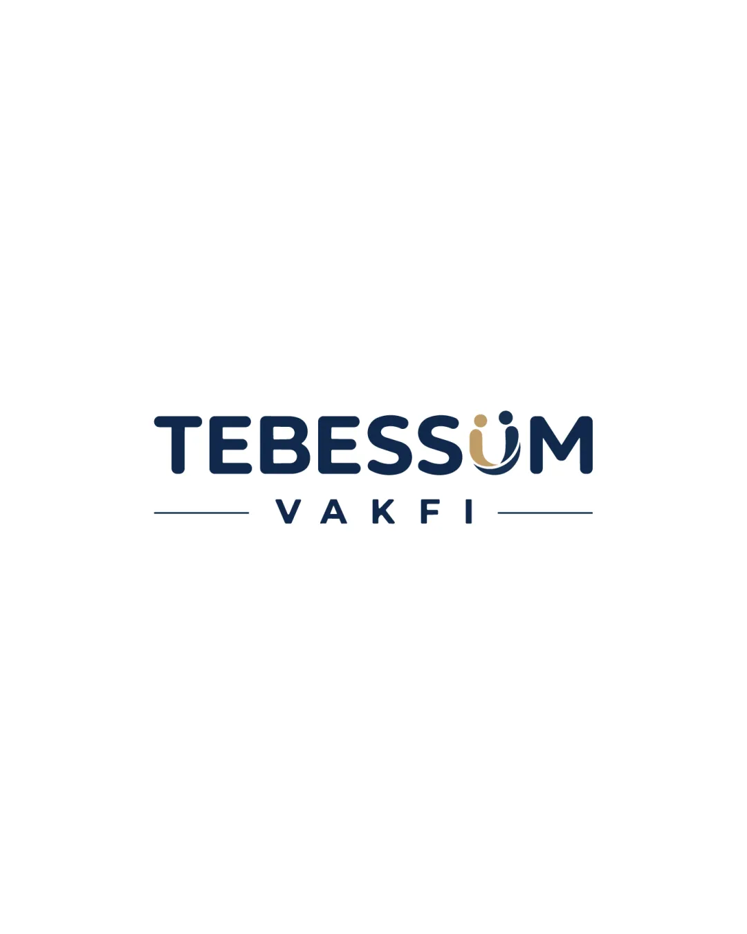
A strong and inviting geometric wordmark, with a sector-appropriate motif in the 'Ü', is visually balanced and highly legible for broad professional deployment.
This wordmark shows excellent execution, supported by text readability and distinctive construction.
Focus on the changes that matter. Keep what makes the logo work.
Check the logo in its intended applications before delivery, and review any optional refinements below.
The warm, smiling motif in a modern wordmark clearly fits a nonprofit sector context, though the symbol could be further differentiated for lasting memorability.

Inspect spacing with the guide. Optical balance may differ from geometric centering.
Get a clear logo score, key risks, and priority fix ideas before your client or audience sees it.
More credits needed
Add credits to continue without losing your work.
Then $7/month. Cancel anytime.
Essential logo review with AI
Estimated progress