PHOENIX HOROLOGY TIMEPIECES logo logo review
3.8/5
Logo score Combination mark category

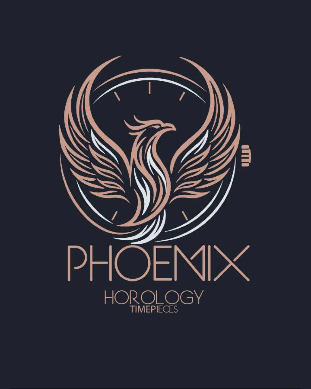
PHOENIX HOROLOGY TIMEPIECES logo

creative172582 Essential logo review

A strong, elegant luxury brand logo with meaningful symbolism and minor scalability and type balance concerns.

This logo lockup shows solid execution, supported by text readability and text hierarchy; improving distinctiveness is the clearest next step.

Combination Mark Line Art, Elegant, Contemporary Watchmaking/luxury Goods
4.4/5
Legibility
3.6/5
Originality
3.7/5
Balance
3.6/5
Scale
4/5
Color
4/5
Style consistency
Your next steps

What to fix first

Focus on the changes that matter. Keep what makes the logo work.

1

mark (phoenix + watch dial)

Test the mark at reduced sizes and consider a simplified variant for tiny applications.

High priority Worth testing Medium effort

The intricate phoenix feathers and line details may lose clarity or merge when scaled down to small sizes (e.g., on watch crowns or small print).

See the category review


Detailed review

Logo performance breakdown

4/5

Brief & logo match

The luxury-inspired phoenix and timepiece motif strongly fit a watch brand; mark detail and unique type suit high-end horology but need small-size optimization.

5/5

Misinterpretations

  • No unintended readings are visible.
4.4/5

Legibility

Wordmark 4/5 · Layout 5/5

  • Main wordmark and secondary text remain readable due to clear letterforms.
4/5

Color harmony

Symbol 4/5 · Wordmark 4/5

  • Rose gold and white pair elegantly, supporting the luxury theme.
rose gold#CCA188
white#FFFFFF

Estimated colors. Use the original design file for exact values.

Create a full color palette using these colors

Create new palette
4/5

Style consistency

  • Mark and wordmark share line style and color, creating an integrated look.
3.7/5

Balance alignment

Symbol 4/5 · Wordmark 3/5 · Layout 4/5

  • Typography and mark are generally balanced; slight typographic eccentricity in 'M' and 'X'.
  • The nonstandard 'M' and widely spaced 'X' create a slight visual imbalance compared to the rest of the wordmark, potentially distracting from legibility and flow.

    Visible issue wordmark ('M' and 'X')
Uploaded logoAlignment guide overlay

Inspect spacing with the guide. Optical balance may differ from geometric centering.

3.6/5

Originality

Symbol 4/5 · Wordmark 3/5

Available in Advanced logo reviews
3.6/5

Scalability

Symbol 3/5 · Wordmark 4/5 · Layout 4/5

Available in Advanced logo reviews
Try your own review

Wondering how your logo performs?

Get a clear logo score, key risks, and priority fix ideas before your client or audience sees it.

Review my logo