EXORA logo review
3.7 / 5
Logo score
Logo review of

Exora

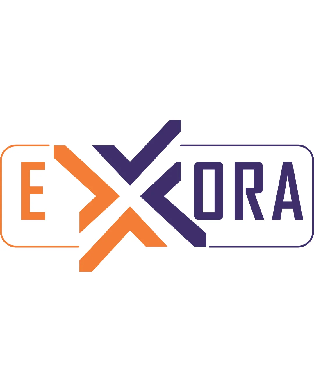
Functional, modern, and visually dynamic, but could benefit from a more cohesive composition and a fresh take on the central mark for true distinctiveness.

Objective AI feedback. Your creative decision.

Combination Mark Geometric, Modern, Dual-color Business Consultancy
4/5
Legibility
3/5
Originality
4/5
Misread
4/5
Balance
4/5
Scale
Action plan

What to fix first

The most important fixes to handle before polishing the full presentation.

1

Integrate the box outlines more seamlessly to avoid visual discontinuity.

Medium priority

Currently, the frame split interrupts logo cohesion.

Impact: Improves Overall Compositional Unity And Visual Flow. · Effort: Medium

2

Soften the 'X' merging point or explore a slightly more unique geometric twist.

Medium priority

Arrows/X are a common visual trope; originality could be improved without losing intent.

Impact: Elevates Memorability And Strengthens Original Identity. · Effort: Medium

Detailed review

Logo performance breakdown

4/5

Legibility

Checkmark icon Most letters are clear and readable.
Checkmark icon Contrast between colors aids readability.

Warning icon The 'X' is a merging point and requires a second look to confirm as two overlapping shapes.
Warning icon The separation can cause a short pause in reading flow.

3/5

Originality

Checkmark icon Dynamic interaction between letterforms with the arrow/X integration.

Warning icon Arrow merging and split-box concept are somewhat common; not highly unique.

4/5

Color harmony

Checkmark icon Orange and purple have strong contrast and dynamism, making both elements distinct.

Warning icon The palette is energetic but not subtle—could feel aggressive for some consultancy contexts.

Orange
#F7941E

Dark Purple
#34246A

Your palette is close. Refine the color roles and combinations before updating the logo.

Build brand colors
4/5

Balance alignment

Checkmark icon Symmetry in the 'X' gives a stable feel.
Checkmark icon Overall rectangular framing aligns both word segments.

Warning icon The left and right framing boxes are visually disconnected, making the overall composition feel split.

logo 200x250 pixels scalability test alignment grid overlay
4/5

Scalability

Checkmark icon Bold forms are scalable to small sizes.
Checkmark icon Limited details maintain clarity in most sizes.

Warning icon Thin outline around the wordmark box may lose clarity at very small sizes.

logo 200x250 pixels scalability test

200x250 px

logo 100x125 pixels scalability test

100×125 px

logo 50x62 pixels scalability test

50×62 px

4/5

Misinterpretations

Checkmark icon No realistic risk of negative or inappropriate reading.
Checkmark icon Abstract 'X' does not suggest unintended connotations.

4 / 5

Logo structure & brief match

Checkmark icon The logomark and wordmark are tightly integrated—'X' forms both central anchor and symbol.

Warning icon The transition between the split parts could be smoother.

Checkmark icon Industry: Dynamic, forward-facing style fits business consultancy aiming for innovation.

Try your own review

Wondering how your logo performs?

Get a clear logo score, key risks, and priority fix ideas before your client or audience sees it.

Review my logo