What to preserve
A minimal, elegant elephant serves as a memorable symbol for exploration, tying into the region and theme effectively.
Spelling & grammar
No obvious issue foundNo visible spelling or grammar errors.
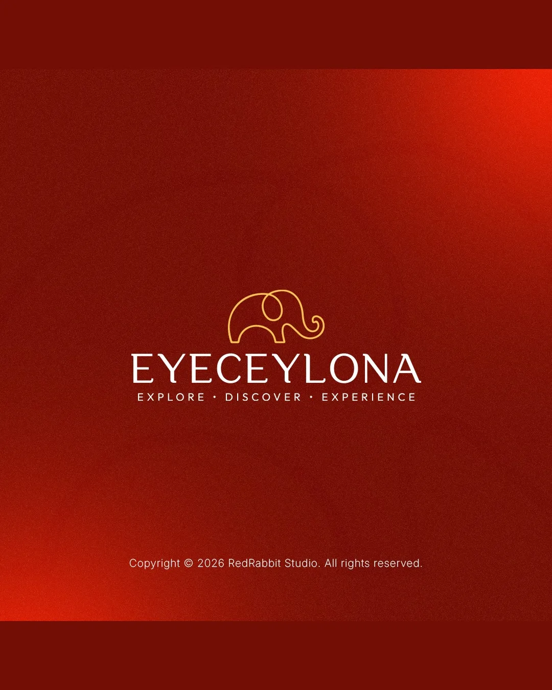
A strong, elegant travel logo with minor adjustments needed for spacing and small-scale clarity.
Focus on the changes that matter. Keep what makes the logo work.
A minimal, elegant elephant serves as a memorable symbol for exploration, tying into the region and theme effectively.
No visible spelling or grammar errors.
Standalone mark (elephant)
Thin lines of the elephant symbol may lose clarity at very small sizes.
See the category reviewStandalone mark and wordmark alignment
The standalone elephant mark floats slightly above the wordmark, creating minor vertical imbalance.
See the category reviewThe logo fits an exploration or tourism brand for Sri Lanka with a distinctive symbol and clear text.
Estimated colors. Use the original design file for exact values.
Create a full color palette using these colors
Create new paletteThe standalone elephant mark floats slightly above the wordmark, creating minor vertical imbalance.
Try: Tweak the vertical spacing between the mark and wordmark for tighter cohesion.

Inspect spacing with the guide. Optical balance may differ from geometric centering.
Thin lines of the elephant symbol may lose clarity at very small sizes.
Try: Test the mark in small-scale versions to check line integrity.
Get a clear logo score, key risks, and priority fix ideas before your client or audience sees it.
More credits needed
Add credits to continue without losing your work.
Then $7/month. Cancel anytime.
Essential logo review
Usually takes under a minute