 View review
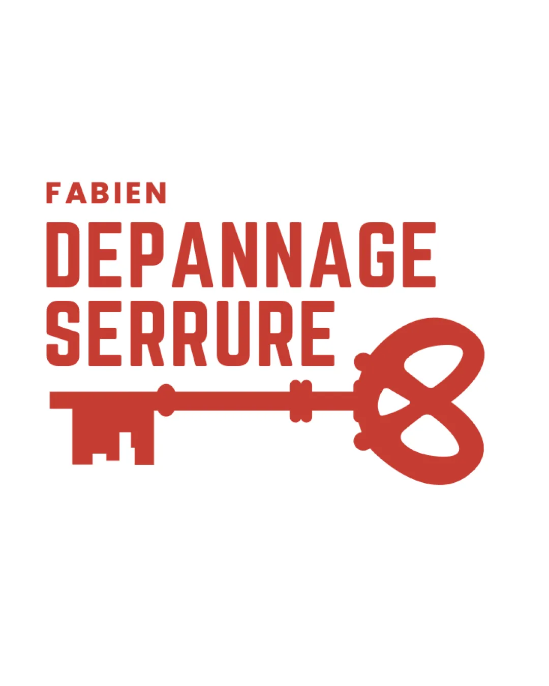
Logo score
Logo review of
Fabien Depannage Serrure
Review the detailed scores below to see what is working and what should be refined first.
Objective AI feedback. Your creative decision.
Legibility
Originality
Balance
Scale
Detailed review
Logo performance breakdown
Legibility
 Clear and bold typography enhances readability.
Originality
The vintage key design adds a unique touch.
 Keys are a common symbol in locksmith logos, reducing originality.
Color harmony
The use of a single color provides harmony and clarity.
Balance alignment
Balanced alignment between text and symbol.

Scalability
Simple design ensures great scalability and versatility.
200x250 px
100×125 px
50×62 px
Symbol & text fit
The text and symbol are well-matched in style.
The logomark could be slightly smaller to enhance balance.
Try your own review
Review my logo
Wondering how your logo performs?
Get a clear logo score, key risks, and priority fix ideas before your client or audience sees it.
Keep exploring