 View review
Logo score
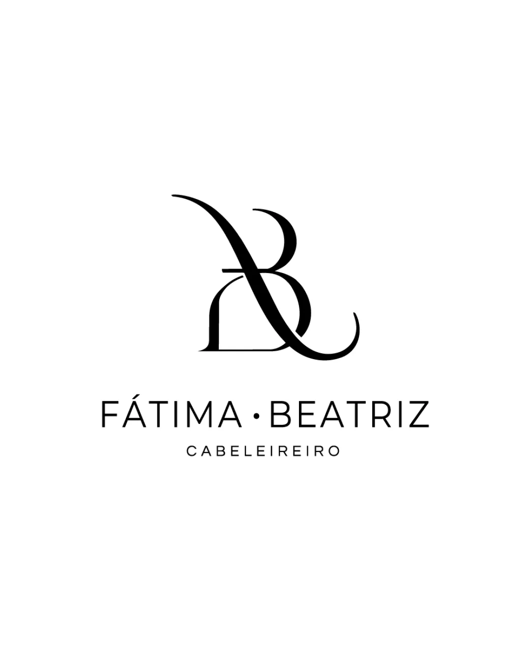
Logo review ofFátima Beatriz, Cabeleireiro
Review the detailed scores below to see what is working and what should be refined first.
Legibility
Originality
Misread
Balance
Scale
Detailed review
Logo performance breakdown
Legibility
![]() Primary wordmark 'FÁTIMA BEATRIZ' is clean and highly readable.
Primary wordmark 'FÁTIMA BEATRIZ' is clean and highly readable.![]() Secondary descriptor 'CABEILEIREIRO' is spaced well and legible for its size.
Secondary descriptor 'CABEILEIREIRO' is spaced well and legible for its size.
![]() The monogram is slightly complex and may not be instantly recognizable as 'F' and 'B' to all viewers due to the intertwining shapes.
The monogram is slightly complex and may not be instantly recognizable as 'F' and 'B' to all viewers due to the intertwining shapes.
Originality
![]() Custom interplay of F and B creates a visually distinctive monogram.
Custom interplay of F and B creates a visually distinctive monogram.![]() Serif and script combination for the monogram is less common in this sector.
Serif and script combination for the monogram is less common in this sector.
![]() While elegant, monogram-based logos are common in beauty/fashion industries, and the approach treads familiar ground.
While elegant, monogram-based logos are common in beauty/fashion industries, and the approach treads familiar ground.
Color harmony
![]() Strong black and white color pairing provides excellent contrast.
Strong black and white color pairing provides excellent contrast.![]() No unnecessary colors or gradients, ensuring a professional and versatile appearance.
No unnecessary colors or gradients, ensuring a professional and versatile appearance.
Black
#000000
White
#FFFFFF
Balance alignment
![]() Excellent vertical alignment between icon and text.
Excellent vertical alignment between icon and text.![]() Symmetry between wordmark and monogram creates a luxurious, balanced feel.
Symmetry between wordmark and monogram creates a luxurious, balanced feel.

Scalability
![]() Simple black-and-white palette enhances reproduction on multiple backgrounds.
Simple black-and-white palette enhances reproduction on multiple backgrounds.![]() Monogram can stand alone for social avatars and small-scale uses.
Monogram can stand alone for social avatars and small-scale uses.![]() Wordmark is clean and can be used without symbol for minimal presentation.
Wordmark is clean and can be used without symbol for minimal presentation.
![]() Thin lines in the monogram may lose clarity at very small sizes, especially in print or embroidery.
Thin lines in the monogram may lose clarity at very small sizes, especially in print or embroidery.![]() Highly detailed curve in the monogram could become illegible as a favicon or on small merchandise.
Highly detailed curve in the monogram could become illegible as a favicon or on small merchandise.
200x250 px
100×125 px
50×62 px
Misinterpretations
![]() No inappropriate or unintended shapes detected within the monogram.
No inappropriate or unintended shapes detected within the monogram.
Symbol & text fit
![]() Both logomark and wordmark use minimalist lines, maintaining stylistic consistency.
Both logomark and wordmark use minimalist lines, maintaining stylistic consistency.
![]() Monogram scale is well proportioned to the wordmark, neither overpowers the other.
Monogram scale is well proportioned to the wordmark, neither overpowers the other.
Try your own review
Review my logo
Wondering how your logo performs?
Get a clear logo score, key risks, and priority fix ideas before your client or audience sees it.
Keep exploring


