Wondering how your logo performs? 🧐
Get professional logo reviews in seconds and catch design issues in time.
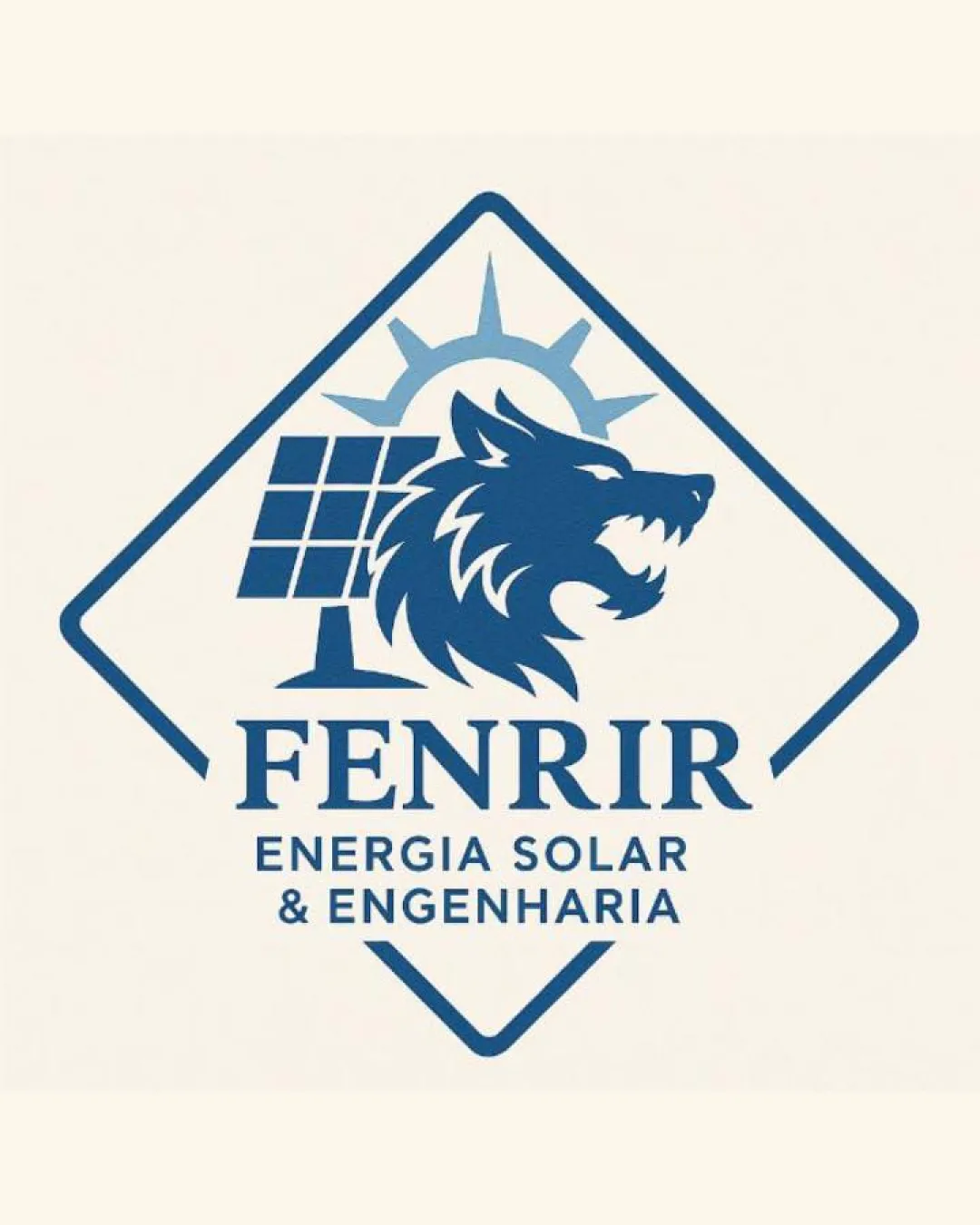
Try it Now!Logo review of FENRIR, ENERGIA SOLAR & ENGENHARIA
 Logo analysis by AI
Logo type:
Style:
Detected symbol:
Detected text:
Business industry:
Review requested by Tzengersantos
**If AI can recognize or misinterpret it, so can people.
Structured logo review
Legibility
![]() Primary wordmark (FENRIR) uses a clean, bold serif font that is highly readable.
Primary wordmark (FENRIR) uses a clean, bold serif font that is highly readable.![]() Secondary descriptor text is clear and well-spaced.
Secondary descriptor text is clear and well-spaced.
Scalability versatility
![]() Logo maintains clarity at moderate sizes due to strong shapes and clear text.
Logo maintains clarity at moderate sizes due to strong shapes and clear text.![]() Simplified shapes help with some scalability.
Simplified shapes help with some scalability.
![]() Fine details in the wolf's fur and sun rays may get lost at small sizes, making it unsuitable for favicons or embroidery.
Fine details in the wolf's fur and sun rays may get lost at small sizes, making it unsuitable for favicons or embroidery.![]() Complex emblem layout might not work on very small promotional products.
Complex emblem layout might not work on very small promotional products.
200x250 px
100×125 px
50×62 px
Balance alignment
![]() Good alignment between symbol and wordmark.
Good alignment between symbol and wordmark.![]() Centralized composition within diamond emblem creates organizational symmetry.
Centralized composition within diamond emblem creates organizational symmetry.
![]() The left-heavy solar panel visually unbalances the symbol slightly compared to the wolf and sun.
The left-heavy solar panel visually unbalances the symbol slightly compared to the wolf and sun.

Originality
![]() Creative combination of wolf, solar panel, and sun references industry and mythological roots.
Creative combination of wolf, solar panel, and sun references industry and mythological roots.![]() Emblematic frame is less common in engineering/solar logos.
Emblematic frame is less common in engineering/solar logos.
![]() Wolf head silhouette is a standard vector style with little unique detailing.
Wolf head silhouette is a standard vector style with little unique detailing.
Logomark wordmark fit
![]() The logomark's boldness and geometric forms match the sturdy serif in the wordmark.
The logomark's boldness and geometric forms match the sturdy serif in the wordmark.![]() Both parts share a consistent color scheme, ensuring visual harmony.
Both parts share a consistent color scheme, ensuring visual harmony.
Aesthetic look
![]() Visually cohesive and modern appearance.
Visually cohesive and modern appearance.![]() Color balance is strong, making the logo timeless and authoritative.
Color balance is strong, making the logo timeless and authoritative.
![]() Somewhat busy due to multiple icons inside a single emblem, may not appeal to minimalistic design standards.
Somewhat busy due to multiple icons inside a single emblem, may not appeal to minimalistic design standards.
Dual meaning and misinterpretations
![]() No inappropriate or unintended visual innuendos detected.
No inappropriate or unintended visual innuendos detected.
Color harmony
![]() Consistent single-color usage enhances professional appeal.
Consistent single-color usage enhances professional appeal.![]() Good contrast against the background for strong visual impact.
Good contrast against the background for strong visual impact.
Denim Blue
#23578C
Off White
#F8F2EA