View review
Figs
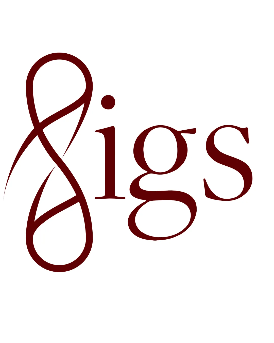
The logo is conceptually strong and visually stylish, with unique cues that fit the target audience and narrative. With focused refinement of the initial letter for clarity, it can become a memorable, professional mark.
Objective AI feedback. Your creative decision.
What to fix first
The most important fixes to handle before polishing the full presentation.
Fix possible misinterpretation
High priorityThe mark could be read as an '8', which introduces mild confusion; possible resemblance to abstract female body shape, which may invite ambiguous readings.
Impact: High · Effort: Medium
Refine the 'F' form for clearer letter recognition without sacrificing hourglass/fig metaphor.
High priorityThe current form delivers concept but weakens instant brand recall. A slight simplification can resolve this.
Impact: Improves Recognition, Reduces Ambiguity, And Increases Professional Impact. · Effort: Medium
Test logo at reduced sizes to ensure 'F' details remain legible.
Medium priorityPotential muddling of thin strokes could undermine the premium effect at smaller scales.
Impact: Addresses Print/web Versatility And Preserves Brand Clarity In Real-world Use. · Effort: Low
Logo performance breakdown
Legibility
'igs' is very readable; serif is classic and attractive.
Highly stylized 'F' may be read as an '8', 'S', or even an ampersand, reducing immediate recognizability.
Originality
Hourglass twist on the 'F' is both conceptually relevant and visually unique.
Motif could be further clarified to reduce reading challenges.
Color harmony
Rich dark red is distinctive and communicates warmth and sophistication.
Dark Red
#600000
Your palette is close. Refine the color roles and combinations before updating the logo.
Build brand colorsBalance alignment
Wordmark is cohesive; 'F' is visually striking.
Strong initial slightly overpowers rest of the word, creating mild imbalance.
Scalability
Major elements are bold and should reproduce in medium-to-large applications.
Complex strokes and negative space in the 'F' could muddle at small sizes.
200x250 px
100×125 px
50×62 px
Misinterpretations
Hourglass/fig reference is well aimed at the brand's message.
The mark could be read as an '8', which introduces mild confusion; possible resemblance to abstract female body shape, which may invite ambiguous readings.
Brief match
Hourglass Inspiration: Successfully interprets the brief's hourglass and fig symbolism, but risks ambiguity in the initial letter.
Audience (women's Fashion): Feminine, sophisticated style aligns with modern women's fashion aesthetics.
Wondering how your logo performs?
Get a clear logo score, key risks, and priority fix ideas before your client or audience sees it.




