View review
Logo score
Logo review of
First Presbyterian Church Of Rumson
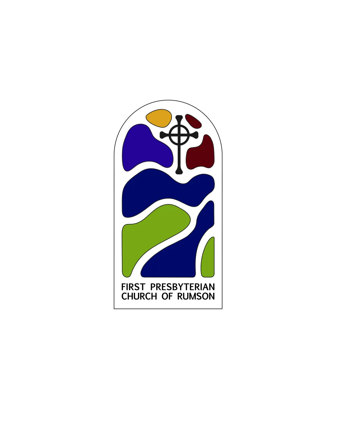
Distinctive, contextually strong, and visually appealing; stands out in the church sector.
Objective AI feedback. Your creative decision.
Legibility
Originality
Misread
Balance
Scale
Action plan
What to fix first
The most important fixes to handle before polishing the full presentation.
1
Slightly simplify the cross detail or ensure a secondary version for small-scale use.
Medium priorityCross fine lines may blur at very small sizes.
Impact: Improves Scalability And Detail Retention On Small Applications. · Effort: Low
2
Create a single-color version for high-versatility applications.
Low priorityComplex color palette may not always be practical.
Impact: Ensures Reproduction Across All Formats And Printing Methods. · Effort: Medium
Detailed review
Logo performance breakdown
Legibility
 Wordmark is clear, well-spaced, and highly readable.
Originality
Stained-glass abstraction feels unique within the church logo niche.
 Use of window motif and cross is traditional, though handled in a fresher way.
Color harmony
Palette mimics stained glass, is vibrant and appropriate for a church.
Many colors may complicate black-and-white or one-color usage.
Purple
#39209a
Blue
#1e68c6
Green
#82b548
Yellow
#e6b12b
Red
#9d2a21
Black
#000000
Your palette is close. Refine the color roles and combinations before updating the logo.
Build brand colorsBalance alignment
Window form centers elements well. Abstract colors balance visual weight.
Slight asymmetry in color shape layout may draw the eye unevenly.

Scalability
Simple forms and thick lines scale well. Abstract shapes maintain integrity at smaller sizes.
Fine detail of the cross may get slightly lost at tiny sizes.
200x250 px
100×125 px
50×62 px
Misinterpretations
No negative readings; shapes are sufficiently abstract.
Logo structure & brief match
Wordmark fits cleanly beneath the mark and feels integrated with the composition.
Industry (church): Concept, imagery, and palette are highly appropriate for a church.
Distinctiveness: Logo is visually memorable and stands out among typical church logos.
Try your own review
Review my logo
Wondering how your logo performs?
Get a clear logo score, key risks, and priority fix ideas before your client or audience sees it.
Keep exploring