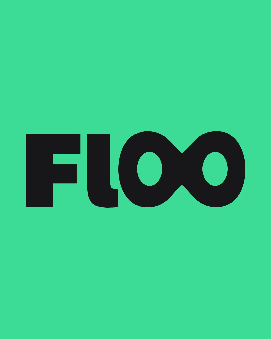
FLOO logo review
4.4 / 5
Logo score
Logo review of

Floo

Distinctive, conceptually relevant, and visually appealing logo that aligns very well with the provided brand values and brief.

Objective AI feedback. Your creative decision.

Wordmark Bold, Geometric, Modern Finance/technology
4.5/5
Legibility
4.5/5
Originality
5/5
Misread
4.5/5
Balance
4/5
Scale
Action plan

What to fix first

The most important fixes to handle before polishing the full presentation.

1

Fine-tune inner spacing around the infinity symbol for extreme small-size clarity.

Medium priority

Increases usable logo range with minimal risk of visual breakdown.

Impact: Improves Versatility And Ensures No Detail Clogs At Reduced Sizes. · Effort: Medium

Detailed review

Logo performance breakdown

4.5/5

Legibility

Checkmark icon Clear, readable sans-serif letters despite creative integration.
Checkmark icon Infinity symbol still reads as 'OO'.

Warning icon Slightly unconventional 'OO' shape may cause a momentary pause for new viewers.

4.5/5

Originality

Checkmark icon Integration of infinity into the wordmark is distinctive and memorable.

Warning icon Infinity as a motif is not new, but well-executed here.

4/5

Color harmony

Checkmark icon On-trend, fresh green conveys a youthful and premium feel.
Checkmark icon Black text contrasts well for maximum clarity.

Warning icon Could benefit from exploring a secondary accent or subtle gradient for added premium feel.

Medium Aquamarine
#2DE3A0

Black
#191919

Your palette is close. Refine the color roles and combinations before updating the logo.

Build brand colors
4.5/5

Balance alignment

Checkmark icon Optically balanced and well-centered composition.
Checkmark icon Infinity symbol creates a unique rhythm.

Warning icon OO/infinity connection introduces a mild visual contrast but is intentional.

logo 200x250 pixels scalability test alignment grid overlay
4/5

Scalability

Checkmark icon Bold forms and high contrast ensure good visibility at small sizes.

Warning icon Tight inner spacing of the infinity symbol could potentially fill in when very small.

logo 200x250 pixels scalability test

200x250 px

logo 100x125 pixels scalability test

100×125 px

logo 50x62 pixels scalability test

50×62 px

5/5

Misinterpretations

Checkmark icon Infinity symbol is universally positive and not ambiguous here.

Brief match

Checkmark icon Fluidity And Clarity: Infinity integration and rounded geometries present a fluid, intelligent, and organized impression.
Checkmark icon Youthful, Premium, Not Overly Corporate: Bright background and soft but confident bold type convey a non-corporate, fresh premium vibe.
Checkmark icon Financial Trust: Strong, geometric construction and simplicity reinforce reliability.

Try your own review

Wondering how your logo performs?

Get a clear logo score, key risks, and priority fix ideas before your client or audience sees it.

Review my logo